How to fixed the layout of page for ALL screens? I mean to say on "ANY" size of COMPUTER SCREEN, Page-layout should be the same.

In fact, i would like to put width:100% ONLY for header and footer.

I would be more than happy IF i can have small EXAMPLE OF CODE which satisfy the results.

Thanks in advanced.
Recommended Answers

All 13 Replies

Here is an example I keep handy...feel free to use and adapt... The header and footer's width will be set to 100%, but the content will have a set width with its left and right margins set to auto.

<!DOCTYPE html>
<html>
<head>
<style>
* {margin: 0;}
html, body {height: 100%;}
#wrapper {min-height:100%;margin: 0 auto -100px;}
#header {background-color:#104ba9;height:100px;}
#content {width:1000px;margin:0 auto;}
#footer {height:100px;background:#6a93d4;}
</style>
</head>

<body>
  <div id="wrapper">
     <div id="header">Header</div>
     <div id="content">Main content</div>
  </div>
  <div id="footer">
     <p>Footer</p>
  </div>
</body>
</html>

How to fixed the layout of page for ALL screens?

No you cannot. You could attempt to do it but you will never be able to do it in all screen sizes/resolutions. A browser is not always being displayed full screen and is not required to be so (as mine is always set to half width of my screen). So in certain cases, your layout will be distorted by the way a client is viewing. You could, however, add a note on your page letting clients know about the resolution that will display your page the best. Also, you should use percentage as JorgeM said, but remember that there is always an exceptional case that you have to ignore.

@JorgeM

Thanks a lot. Your example is very helpful to me. This is what i have expected.

I just miss to add one thing only. Where i should put width:940px; in order to get the header and footer's width:100%.

In fact, my ALL CONTENT (header + body + footer) ("Everything on Page") must be stay in width:940px.

I hope you may get the difference between current and expected result.

@Taywin:
I do not know exactly how but it is possible.

Made some additional adjustments outside of the width of 940px; encountered an issue where content overlapped into the footer. added a div (seperator) to prevent the content from overlapping.

<!DOCTYPE html>
<html>
<head>
<style>
* {margin: 0;}
html, body {height: 100%;}
#wrapper {min-height:100%;margin: 0 auto -75px;width:940px;background:#efefef}
#header {background-color:#104ba9;height:100px;}
#content {margin:0 auto;}
#footer {background:#6a93d4;height:75px;margin: 0 auto;width:940px;}
#seperator {height:60px;}
</style>
</head>
<body>
  <div id="wrapper">
     <div id="header">Header</div>
     <div id="content">
        <p>Your website content here</p>
     </div>
     <div id="seperator"></div>
  </div>
  <div id="footer">
     <p>Footer</p>
  </div>
</body>
</html>

I think min-width:940px; CSS property may help forcing a browser to display at least with the specified width.

Once again, Let me clear my question.

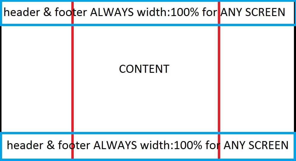
Please have a look at the image LAYOUT.

I hope with the image, all will be clear.

BLACK-Border: ANY SIZE Computer Screen

LAYOUT
ALWAYS, i would to like to put ALL my data (header + content + footer) BETWEEN RED Column.

Your explanation is still not 100% clear because you are showing a picture with a header and footer that span 100% of the width of the screeen, but you indicate that you want the header, content and footer to be located in the middle of the screen at 940px;

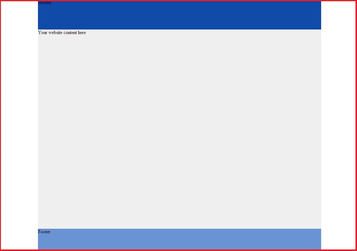
So the code in the previous post that I provided above produces the results shown in the first image, and the code in this post produces what I beleive you are trying to accomplish which is the header and footer spanning across the screen, but with the text/image/content within the center area. The way that this can be accomplished is by having two headers and two footers. One set of headers and footers will span 100% of the width, while the other set of headers and footers only spans 940px and is horizontally centered. The header and footer that spans 100% needs to be placed behind the other set so we assign a z-index property and "push" it behind it.

Here is the sample code and the set of images below. If that is not what you are looking for then, my appologies, it is evident that I cant figure out what you are having trouble width...

CODE for Figure 2

******

<!DOCTYPE html>
<html>
<head>
<style>
* {margin: 0;}
html, body {height: 100%;}
#wrapper {min-height:100%;margin: 0 auto -75px;background:#efefef}
#header {background-color:#104ba9;height:100px;width:940px;margin:0 auto;}
#headerOuter {background-color:#104ba9;height:100px;z-index:-1}
#content {margin:0 auto;width:940px;}
#footer {background:#6a93d4;height:75px;margin: 0 auto;width:940px;}
#footerOuter {background:#6a93d4;height:75px;z-index:-1;}
#seperator {height:60px;}
</style>
</head>
<body>
  <div id="wrapper">
     <div id="headerOuter">
     <div id="header">Header</div>
     </div>
     <div id="content">
        <p>Your website content here</p>
     </div>
     <div id="seperator"></div>
  </div>
  <div id="footerOuter">
  <div id="footer">
     <p>Footer</p>
  </div>
  </div>
</body>
</html>

page1page2

Simply, i would like to put ONLY background image/colour in header and footer which has width:100% = Full Width of ANY SCREEN. And For example, Let's say width:940px, INSIDE that, i want to put my ALL real content of page. Menu(Header), Body, Footer content will always remain in width:940px.

So, finally, when one look at page it will look SAME as my image LAYOUT.

Did i answer your question?

I guess there is a communication problem here. I am really sorry about that... I dont mean to frustrate you or me. Based on your description in this thread, the solutions I provided above, I thought made sense to what you are asking.

I hope that someone else can chime in and hopefully understand what you are asking for and help you with this.

@JorgeM

Solved. Thank you so much. I got 100% result. Now, i got the DESIGN that i was expected. But i am not 100% clear with spacing and size.

I have to understand the z-index.

Last question: If possible, Can you explain me the use of z-index with solid example?

The z-index property specifies the stack order of an element. This is useful because sometimes elements can overlap each other. For example, you may want to fix the position of a image, or have different divs placed in different locations on the page. If they overlap, you can use the z-index property to indicate the stack order. The lower the number mean that the element is farther in the back. A higher number means that the element will be stacked on top (front). The example I provided, for example has two headers... one with a width of 100% and another with a width of 940px. The one with 940px has the text so I wanted that header div to be in front of the header div that spans the width of the screen since that other div has no text. It's only purpose is to fill the width.

If the information I provided you did not help you solve the problem, it would be good if you post what the actual solution was so that others reading this thread can benefit from your solution.

@JorgeM

Figure 2 is the PERFECT solution for my question.

Thanks for the explanation. I got it. I have never used it before and now i came to know that why it is so important.

very nice discussion.......i m enjoying the forum

Be a part of the DaniWeb community

We're a friendly, industry-focused community of developers, IT pros, digital marketers, and technology enthusiasts meeting, networking, learning, and sharing knowledge.