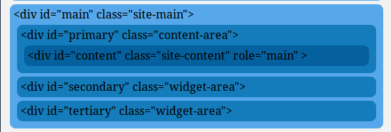
I have the following:

<div id="main" class="site-main">
  <div id="primary" class="content-area">
    <div id="content" class="site-content" role="main">Main</div>
  </div>
  <div id="secondary" class="widget-area">Secondary</div>
  <div id="tertiary" class="widget-area">Tertary</div>
</div>

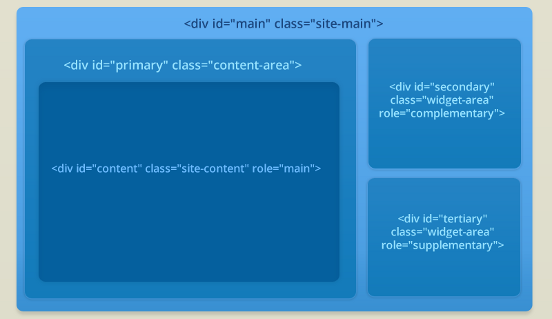
It displays on the page as a series of rows, one beneath the other, each row taking the full width of the containing div.

What I want is two columns, much as would be rendered from the following HTML:

<table width="100%">
  <tr>
    <td rowspan="2" width="50%">
      <table><tr><td>Main</td></tr></table>
    </td>
    <td width="50%">
      Secondary
    </td>
  </tr>
  <tr>
    <td width="50%">
      Tertary
    </td>
  </tr>
</table>

Can someone suggest CSS coding that would do this?

If I use float: left; and float: right;, then the collumns shrink to dots and the "Secondary" and "Tertiary" cells appear outside the "main" class table.

~ Dave

Recommended Answers

All 7 Replies

Just to clarify, this is what I have 97f3fee45d8ff62ef9c4a108c84a0f7f

This is what I want it to look like:
eb6234507aa0d4a5338d495f51e9bf8f

My style sheet is as follows:

#main {
  margin: 5px;
  padding: 5px;
  background-color: #57A8EB;
  border-radius: 8px;
}
#primary {
  margin: 5px;
  padding: 5px;
  background-color: #147CBB;
  border-radius: 8px;
}
#secondary {
  margin: 5px;
  padding: 5px;
  background-color: #147CBB;
  border-radius: 8px;
}
#tertiary {
  margin: 5px;
  padding: 5px;
  background-color: #147CBB;
  border-radius: 8px;
}
#content {
  margin: 5px;
  padding: 5px;
  background-color: #05609E;
  border-radius: 8px;
}

This is close. Needs more tweaking, but it's 1AM here...

<!DOCTYPE html>
<html lang="en">
<head>
<meta charset="utf-8">
<title>DaniWeb Question</title>
<style type="text/css">
 html,body { height:100%; }

    #main {
    margin: 5px;
    padding: 5px;
    height:96%;
    background-color: #57A8EB;
    border-radius: 8px;
    color:#fff;
    }
    #primary {
    float:left;
    margin: 1%;
    padding: 5px 1%;
    width:65%;
    min-width:300px;
    min-height:96%;
    background-color: #147CBB;
    border-radius: 8px;
    }
    #content {
    margin: 1% 0;
    padding: 1%;
    height:750px;
    max-height:96%;
    background-color: #05609E;
    border-radius: 8px;
    }

    #columnRight {
    float:left;
    width:30%;
    min-width:300px;
    height:90%;
    }
    #primary:after, columnRight:after {
    content:'';
    display:block;
    height:0;
    visibility:hidden;
    clear:both;
    }
    #secondary, #tertiary {
    margin: 3% 1%;
    padding: 2%;
    min-height:51.5%;
    background-color: #147CBB;
    border-radius: 8px;
    }

</style>
</head>
<body>
    <div id="main" class="site-main">
     <div id="primary" class="content-area">
      <div id="content" class="site-content" role="main">Content</div>
     </div><!-- end #primary -->
    <div id="columnRight">
     <div id="secondary" class="widget-area">Secondary</div>
     <div id="tertiary" class="widget-area">Tertary</div>
    </div><!-- end #columnRight -->
    </div><!-- end #main -->
</body>
</html>

Thank you both.

@rtrethewey:
If I float the ColumnRight left as you indicate, the column is rendered beneath the Primary column and not to the right of it. Furthermore it overlaps outside the Main section and I want it to remain within it.

If I float the ColumnRight right instead, then it is rendered to the right of the Primary column, but below it rather than beside it (see screenshot)
de629587b6f5011f82512d0245b5044e

@GliderPilot: thanks, that is useful, particularly the use of absolute positioning within a container which has been set to relative positioning. However, my Secondary and Tertiary elements extend outside of the ColumnRight container (which is set to 'absolute') and also outside of the Main container (set to 'relative'). See below. f64ef181a34c5ed2204399b3b54f77d9

Ah.

My bad.

I had stuck an empty <div style="clear: both;"></div> between the Primary and the Sidebar divs.

<div id="main" class="site-main">
<div id="primary" class="content-area">
  &lt;div id="primary" class="content-area"&gt;
    <div id="content" class="site-content" role="main">
      &lt;div id="content" class="site-content" role="main" &gt;
    </div><!-- #content .site-content -->
</div><!-- #primary .content-area -->

<div style="clear: both;"></div>

<div id="sidebar" class="widget-area">
  &lt;div id="sidebar" class="widget-area"&gt;
  <div id="secondary" class="widget-area">
  &lt;div id="secondary" class="widget-area"&gt;
  </div><!-- #secondary .widget-area -->
  <div id="tertiary" class="widget-area">
  &lt;div id="tertiary" class="widget-area"&gt;
  </div><!-- #tertiary .widget-area -->
</div>

Damn fool!

Thanks to both of you, you've helped a lot.

Just to add that I used overflow: hidden; in the #main div block's CSS to solve the problem of the sidebar leaking out of the Main container.

.site-main{width:100%;}
.content-area{width:50%; float:left;}
.widget-area{width:25%;float:left;}

 use this css code for 2 dives are appear side by side.
Be a part of the DaniWeb community

We're a friendly, industry-focused community of developers, IT pros, digital marketers, and technology enthusiasts meeting, networking, learning, and sharing knowledge.