What Are Voronoi Diagrams?
Voronoi Diagrams are an essential visualization to have in your toolbox. The diagram’s structure is a data-driven tessellation of a plane and may be colored by random or to add additional information.
Learn the Lingo
The set of points that generate the Voronoi diagram are called “seeds” or “generators” for they generate the polygon shapes; in practice, the seeds are your cleaned data. Each seed generates its own polygon called a Voronoi “cell,” and all of 2-dimensional (2D) space is associated with only one cell. A Voronoi cell, or Voronoi “region” denotes all of the space in the plane that is closest to its seed. Cell boundaries shared between two regions signify the space that is equally distant, or “equidistant”, to the seeds.
Formal Definition
Given a distance metric dist and a dataset D of n 2-dimensional generator coordinates, a Voronoi diagram partitions the plane into n distinct regions. For each seed k in D, a region Rk is defined by the Region equation.

In English, the equation is “This region is equal to the set of points in 2D space such that the distance between any one of these points and this generator is less than the distance between the point and all other generators.” To fully understand the math, be sure to map the words to every symbol in the equation. It’s important to recall that a generator, Dk, comes from the input data, whereas points in its region, Rk, is the output.
The Voronoi Diagram is the concatenation of n regions generated by the seeds. Importantly, note that if the region’s generator is on the edge of the seed space and has no possible intersections, it will extend to infinity. This extension occurs because regions are defined as all points nearest to a single seed and not the others so, since 2D space has infinite coordinates, there will always be infinite regions.
How to Make Voronoi Diagrams
With an idea of what Voronoi diagrams are, we can now see how to make your own in Python. While we won’t cover the algorithms to find the Voronoi polygon vertices, we will look at how to make and customize Voronoi diagrams by extending the scipy.spatial.Voronoi functionality.
Before, Voronoi diagrams were defined as the concatenation of regions (Region Eq.) generated by the seeds. Regions were polygonal subsets of 2D space, i.e. a collection of points with a boundary, composed of points closest to the region’s seed. In practice, Voronoi cells are usually represented through their polygon vertices (Voronoi vertices) rather than by a collection of points; this makes sense if you consider the inefficiency of directly storing points.
Easy Examples
To illustrate what Voronoi diagrams are and how to make them, let’s start with a very simple dataset: the four corners of the unit square. Each corner will be a seed, so there will be four Voronoi cells.
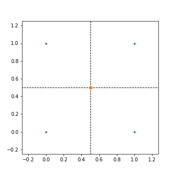
Seeds are colored as blue dots at the corners of the unit square, dotted lines represent edges of an infinite polygon, and orange dots are Voronoi vertices. As for an interpretation, this diagram labels all of 2D space into two categories: any point on the plane is either closest to one of four corners in the unit square (i.e. within a square), or it is equally distant to at least two corners (i.e. along a line or on an orange dot). Since all of the cells are on the edge with no possible intersections, there are no finite polygons.
Before we add one more point to the square to get a finite region, let’s show the Python code to generate these simple diagrams.
from scipy.spatial import Voronoi, voronoi_plot_2d
import matplotlib.pyplot as plt
%matplotlib inline

# Calculate Voronoi Polygons
square = [(0, 0), (0, 1), (1, 1), (1, 0)]
vor = Voronoi(square)

def simple_voronoi(vor, saveas=None, lim=None):
    # Make Voronoi Diagram
    fig = voronoi_plot_2d(vor, show_points=True, show_vertices=True, s=4)

    # Configure figure
    fig.set_size_inches(5,5)
    plt.axis("equal")

    if lim:
        plt.xlim(*lim)
        plt.ylim(*lim)

    if not saveas is None:
        plt.savefig("../pics/%s.png"%saveas)

    plt.show()

simple_voronoi(vor, saveas="square", lim=(-0.25,1.25))
Conveniently, scipy.spatial utilizes an optimized computational geometry library to compute Voronoi tessellations, so we won’t have to worry about those details. All you need to know is the Voronoi object vor contains all of the Voronoi information (regions, ridges, vertices, etc.) for plotting diagrams. And scipy.spatial.voronoi_plot_2d plots this information into a Voronoi diagram.
The only required input to plot a diagram through simple_voronoi is a list of coordinate tuples or the seeds that generate the Voronoi cells. So, by adding a single point in the center of the unit square we can make a finite region.
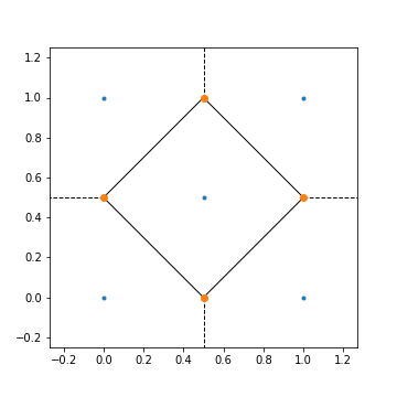
The legend is the same as before except there are now filled lines, Voronoi ridges of a finite region. In the center lies the only finite Voronoi cell, the unit diamond. Any point within this diamond is closest to the center seed (0.5, 0.5) and no other. Notice that the addition of a single generator produced three more Voronoi vertices, but the number of cells always equals the number of generators.
Looking only at the two figures so far, you may think that Voronoi diagrams are always symmetrical. But if the seed space is more complicated, then its Voronoi representation will become less ordered. Let’s add five random points (n_randoms) to the unit diamond’s seeds and see the resulting diagram; four separate random additions are done.
import numpy as np

n_randoms = 5

for i in range(4):
    randos = five + np.random.rand(n_randoms, 2).tolist()
    vor = Voronoi(randos)
    simple_voronoi(vor, lim=(-1.5,2.5), saveas="rand%s"%i)
Produces the following:
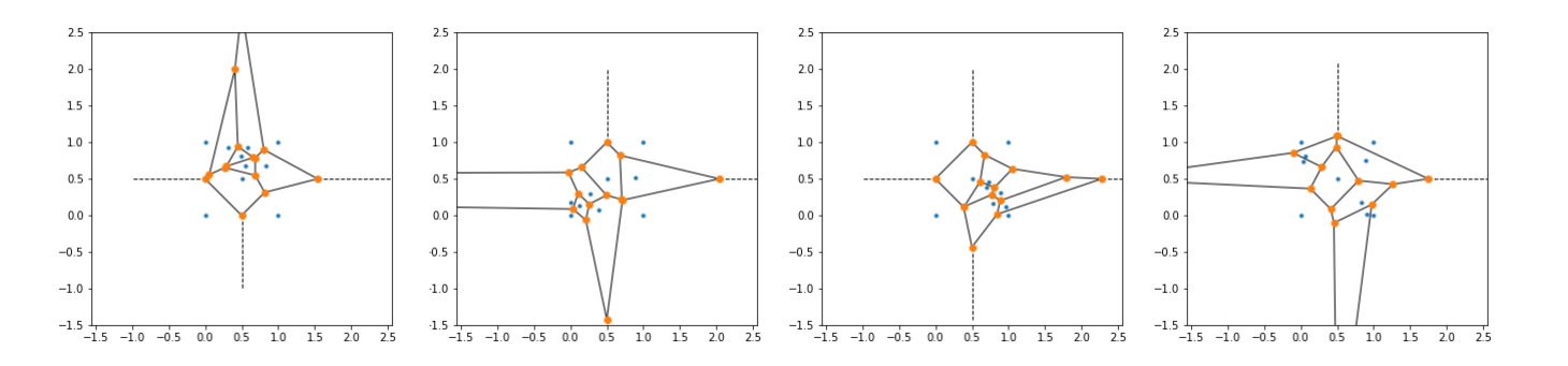
Adding random seeds produces an asymmetrical Voronoi diagram, which better simulates what you may see for real-life data. However, our current visualization procedure for irregular generators is lackluster and complicated-looking, especially for greater than 10 seeds. The clearest way to better the images would be to remove any unnecessary features (e.g., dots on vertices) and to color the cells.
In the next section, we modify the Voronoi object to later improve our Voronoi visualization to produce more attractive images.
Finitize Voronoi Polygons
In scipy.spatial’s Voronoi object, a finite region is enumerated as a list of Voronoi vertices. And, recall that the outermost regions of any Voronoi diagram may extend infinitely. To represent these infinite regions, the Voronoi object uses a “-1” instead of a coordinate to denote an open-faced polygon.
While it’s more accurate to have infinite regions be defined as an open-faced polygon, there must be a finite “cutoff” somewhere to be able to visualize the diagram. In our earlier diagrams, we simply limited the image frame to a square that included enough information; in some sense, this is like closing the infinite region’s open face with the edge of the image. Although the limitation of the image itself works fine, if you want to color the Voronoi regions, the region’s data structure must be finite.
Luckily, a function has already been made to finitize scipy.spatial’s Voronoi polygons. The function, voronoi_finite_polygons_2d, receives the Voronoi object and adds a far-away vertex to each infinite region to close its open-faced polygon; star it on GitHub if you find it useful.
Generate n Random Seeds
It’s now time to code a method to generate our input seeds. Since we’re only concerned with visual customization, a function to make n random Voronoi polygons will suffice.
def voronoi_polygons(n=50):
    random_seeds = np.random.rand(n, 2)
    vor = Voronoi(random_seeds)
    regions, vertices = voronoi_finite_polygons_2d(vor)

    polygons = []
    for reg in regions:
        polygon = vertices[reg]
        polygons.append(polygon)
    return polygons
Numpy.random.rand(n, m) produces an n by m array of uniformly-distributed random numbers (“random_seeds”); in our case, it will contain n 2D coordinates with values between 0 and 1. A Voronoi object is created from random_seeds and then passed to voronoi_finite_polygons_2d. The finite polygons are listified, so each element in polygons is a list of vertices.
How to Randomly Color
The now finite Voronoi cells are ready to be colored. Remember that colors can be encoded as a "rgba" vector specifying degrees of red, green, blue, and alpha. Alpha is the opacity parameter where more alpha yields more opacity; 0 is fully transparent, 1 is fully opaque. We can create a function to randomly generate rgba vectors by simply returning 4 random numbers.
import random
def random_color(as_str=True, alpha=0.5):
rgb = [random.randint(0,255),
random.randint(0,255),
random.randint(0,255)]
if as_str:
return "rgba"+str(tuple(rgb+[alpha]))
else:
# Normalize & listify
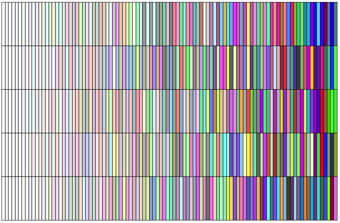
return list(np.array(rgb)/255) + [alpha]The as_str keyword determines the return type since some libraries use different conventions for rgba vectors. To test and demonstrate random_color, test_random_color plots randomly-colored slits with an increasing alpha (left to right).
def test_random_color(gridsize=(5,100), figsize=(12,8)):
    fig, axarr = plt.subplots(*gridsize, figsize=figsize)
    for i, ax in enumerate(axarr.flatten())
        # Remove ticks
        ax.axes.get_xaxis().set_visible(False)
        ax.axes.get_yaxis().set_visible(False)

        # Calculate alpha as normlized column #
        alpha = (i % gridsize[1]) / (gridsize[1] - 1)
        ax.set_facecolor(random_color(as_str=False, alpha=alpha))

    plt.subplots_adjust(hspace=0, wspace=0)
    plt.savefig("../pics/test_random_color.png")
    plt.show()

test_random_color()
Produces the following:
Plot Colored Polygons
Now that we have a list of polygons and a coloring mechanism, it's time to bring it all together on Matplotlib.
import matplotlib.pyplot as plt
from matplotlib.patches import Polygon

def plot_polygons(polygons, ax=None, alpha=0.5, linewidth=0.7, saveas=None, show=True):
    # Configure plot
    if ax is None:
        plt.figure(figsize=(5,5))
        ax = plt.subplot(111)

    # Remove ticks
    ax.set_xticks([])
    ax.set_yticks([])

    ax.axis("equal")

    # Set limits
    ax.set_xlim(0,1)
    ax.set_ylim(0,1)

    # Add polygons
    for poly in polygons:
        colored_cell = Polygon(poly,
                               linewidth=linewidth,
                               alpha=alpha,
                               facecolor=random_color(as_str=False, alpha=1),
                               edgecolor="black")
        ax.add_patch(colored_cell)

    if not saveas is None:
        plt.savefig(saveas)
    if show:
        plt.show()

    return ax
In summary, plot_polygons configures the axis to plot on, adds the colored polygons, then saves/shows the diagram. Notably, there are two alpha parameters: one in random_color, the other in Polygon. To avoid unintended results, setting random_color's alpha to 1 ensures that the parameterized Polygon alpha behaves properly.
The function is designed to easily visualize the Voronoi diagram from the input polygons. Therefore, only one line of code is required to get the good-looking plot.
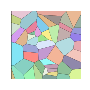
plot_polygons(voronoi_polygons())Produces the following:
While the image is exactly what we wanted, let's demonstrate the capabilities of plot_polygons like we did with random_color_test. Each plot in the grid will be a randomly- seeded, randomly-colored Voronoi diagram at a certain seed number and alpha value.
def test_plot(gridsize=(5,5), figsize=(12,8)):
    fig, axarr = plt.subplots(*gridsize, figsize=figsize)
    for i in range(axarr.shape[0]):
        for j in range(axarr.shape[1]):
            ax = axarr[i,j]

            # Calc. alpha
            alpha = (j % gridsize[1]) / (gridsize[1] - 1)
            if alpha==0: alpha+=0.1  # Set lower bound

            num_seeds = 4**(i+1)

            plot_polygons(voronoi_polygons(n = num_seeds),
                          ax,
                          alpha = alpha,
                          show = False)
            ax.set_aspect("equal","box")

            if j == 0: ax.set_ylabel("%d"%(num_seeds), size="large", rotation=90)
            if i == 0: ax.set_title("%.2f"%(alpha))

    fig.text(x=0.5, y=0.95, s="Alpha", size=20)
    fig.text(x=0.1, y=0.50, s="# of Seeds", size=20, rotation=90)

    plt.savefig("../pics/test_plot.png")
    plt.show()

test_plot()
Produces the following:
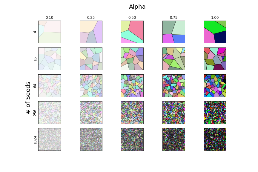
As the axis labels explain, the rows have an increasing number of seeds where columns have an increasing alpha.
In Closing
After learning what Voronoi diagrams are, we learned how to create them. Then, we finitized the data structure to improve its visualization. Since data in this tutorial was randomly-generated, it might be difficult to conceive of practical applications. However, the functions outlined here were designed to be adaptable to new applications. I encourage you to build from here.


