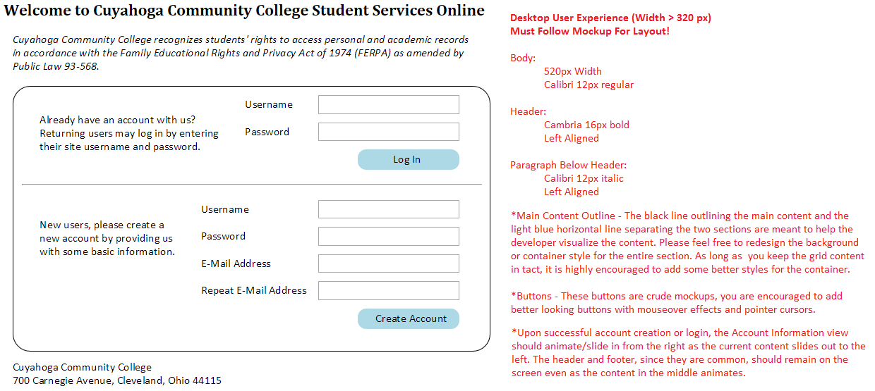
I am having trouble with getting my textboxes and buttons aligned to look like the attached image. Can someone please also tell how I should make the radius border around my element smaller like the pic. Here is my code so far. Any suggestions would be much appreciated.
@model FinalProject.Models.HomeViewModel

<html>

    <head>

        <link href="~/Styles/Home.css" rel="stylesheet" />
        <title>Project</title>

    </head>

    <body>
        <script src="~/Scripts/jquery-2.1.1.min.js"></script>

        <script src="~/Scripts/jquery-ui.min.js"></script>
        <script src="~/Scripts/Home.js"></script>

        <div class="intro">

          <h1>Welcome to Cuyahoga Community College Student Services Online</h1>

            <p>Cuyahoga Community College recognizes students' rights to access personal and academic records
              in accordance with the Family Educational Rights and Privacy Act of 1974 (FERPA) as amended by Public Law 93-568.</p>
        </div>
        <br/>

        <div class="content">
        <p id="para1">Already have an account with us? Returning users may log in by entering their site username and password. </p>
            <div class="username-label">Username </div>
            <div class="username-textbox">
                <input class="existing username-input-textbox" type="text" value="" />
            </div>

            <div class="password-label">Password</div>
            <div class="password-textbox">
                <input class="existing password-input-textbox" type="text" value="" />
            </div>
            <button id="button1">Log in</button>
            <hr />

            <p id="para2">New users, please create a new account by providing us with some basic information.</p>
            <div class="Username-label1">Username: </div>
            <div class="username-textbox1">
                <input class="username-new-input-textbox" type="text" value="" />
            </div>
            <div class="Password-label2">Password:</div>
            <div class="password-textbox2">
                <input class="password-new-input-textbox" type="text" value="" />
            </div>
            <div class="Email-label3">Email:</div>
            <div class="email-textbox3">
                <input class="email-new-input-textbox" type="text" value="" />
            </div>
            <div class="Repeat-Email-label4">Repeat Email Address:</div>
            <div class="repeat-email-textbox4">
                <input class="reenter-new-input-textbox" type="text" value="" />
            </div>
            <button id="button2">Create Account</button>

        </div>

        <footer>Cuyahoga Community College</footer>
        <footer>700 Carnegie Avenue, Cleveland, Ohio, 44115</footer>
    </body>

</html>

--CSS CODE

.intro h1{
    font-family: 'Cambria';
        font-size: 16pt;
        font: bold;
        text-align: left;
}

.intro p{

    font-family: 'Calibri';
    font:italic;
    font-size: 12pt;
    padding: 0px 690px 0px 20px;
    text-align: left;

}
.content{
     border: 2px solid;
     -webkit-border-radius: 12px;
     -moz-border-radius: 12px;
     border-radius: 12px;
}
#para1{
    padding: 0px 1050px 0px 20px;

}
#para2{
    padding: 0px 1099px 0px 20px;
}
.username-label, .username-textbox, .password-label, .password-textbox{
   margin: 0px 0px 0px 400px;
}

#button1, #button2{
    background-color: #add8e6;
}

--CSS CODE

.intro h1{
    font-family: 'Cambria';
        font-size: 16pt;
        font: bold;
        text-align: left;
}

.intro p{

    font-family: 'Calibri';
    font:italic;
    font-size: 12pt;
    padding: 0px 690px 0px 20px;
    text-align: left;

}
.content{
     border: 2px solid;
     -webkit-border-radius: 12px;
     -moz-border-radius: 12px;
     border-radius: 12px;
}
#para1{
    padding: 0px 1050px 0px 20px;

}
#para2{
    padding: 0px 1099px 0px 20px;
}
.username-label, .username-textbox, .password-label, .password-textbox{
   margin: 0px 0px 0px 400px;
}

#button1, #button2{
    background-color: #add8e6;
}