Hey,

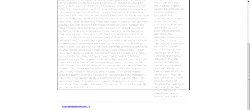
Is it possible to make the content and the navigation fit to content but both the content (black outline) and the side navigation automatically fit to the footer.. as you can see from the image below the side content goes passed the footer

(CSS newbie here)

http://i5.photobucket.com/albums/y161/lochii/div-problem.gif

Dani AI

Generated

— the symptom (sidebar running past the footer) usually means the sidebar is removed from normal flow (floated or absolutely positioned) or the border is on the wrong element. and pointed in the right direction; here is a concise, modern approach that keeps the footer where it belongs and makes the "black outline" follow the content height.

Use a page wrapper and make the main area a flex container so both columns always match height and the footer sits below. Example HTML structure:

<div class="page">
  <header>...</header>
  <main class="cols">
    <section class="content">...</section>
    <aside class="sidebar">...</aside>
  </main>
  <footer>...</footer>
</div>

CSS (modern, simple):

html, body {height:100%;}
.page {min-height:100vh; display:flex; flex-direction:column;}
.cols {display:flex; flex:1; align-items:stretch;}
.content {flex:1; padding:20px; border:1px solid #000;}
.sidebar {width:220px;}

Notes and fallbacks: do not use fixed heights on the content area; that breaks when text grows. If you must support very old browsers, the display:table / table-cell trick gives equal-height columns without flexbox. Also check for any position: absolute on the sidebar — absolute positioning will let it overflow the flow and appear past the footer. Make sure the footer is inside the same wrapper and not positioned off-document.

Quick debugging checklist: inspect the sidebar in devtools to see if it is floated/absolute, verify the footer is inside the wrapper, and test removing custom heights to let elements size naturally.

Further reading: MDN Flexbox basics (MDN Flexbox) and a classic sticky-footer discussion (CSS-Tricks sticky footer).

Recommended Answers

All 2 Replies

1.) Have less textual content.
2.) Make the black outline automatically expand. (Uh, I think you'd need background: url(images/image) repeat-y or something. I'm not a CSS guy, but I think it goes something like that.

You can always try to Google it, or head over to www.w3schools.com and find your answer.

It would help to see your code.

If you are trying to make content fit within one screen on each user's monitor, it is not possible without all kinds of tricky JS programming. The web is designed so content expands downward to accommodate all available text.

The internet is not designed to give you a screen to play with. There is no such thing as a footer in web design (other than a displayed last line of a table). The best you can do is adjust things so they fit on the smallest resolution (use 640 x 480), and then let them expand or move as needed on larger screens.

You can approximate, by using sizes defined in inches or centimeters. Put everything you want contained inside a div having a defined size and a black border.

But be prepared for the div to expand beyond the defined size if the content won't fit. Divs are fluid in nature.

Be a part of the DaniWeb community

We're a friendly, industry-focused community of developers, IT pros, digital marketers, and technology enthusiasts meeting, networking, learning, and sharing knowledge.