Hey,
I need to make a bootstrap footer like the one on the bottom of this site http://drantipov.com/ . (I'm using Bootstrap v2.3.2. I'm using this version because my website looks compact and small - the way I need this. But when I try to use Bootstrap v3.3.5 - new version - I can't make the design that I need.) But I don't need it to be ".container-fluid", I want it be a responsive fixed width container - ".container". I don't want it to be sticky. I just need to know how to make those 3 columns with links. Without the column with the logo.
Can someone please help me?
Thanks.

Dani AI

Generated

Quick, BS2-friendly approach that fits your constraints: use a fixed .container, a .row and three equal columns with .span4. was right to check the reference site with dev tools; since you’re on Bootstrap 2.3.2 you must use the 2.x grid (not the v3 col- classes). ’s .span6 tip is useful when you want two equal halves — for three columns use three .span4 elements (12 total).

Example HTML (place this after your main content; do not use position:fixed or sticky if you want a normal footer):

<footer class="site-footer">
  <div class="container">
    <div class="row">
      <div class="span4">
        <h5>Products</h5>
        <ul class="unstyled">
          <li><a href="#">Product A</a></li>
          <li><a href="#">Product B</a></li>
        </ul>
      </div>

      <div class="span4">
        <h5>Company</h5>
        <ul class="unstyled">
          <li><a href="#">About</a></li>
          <li><a href="#">Careers</a></li>
        </ul>
      </div>

      <div class="span4">
        <h5>Support</h5>
        <ul class="unstyled">
          <li><a href="#">Contact</a></li>
          <li><a href="#">FAQ</a></li>
        </ul>
      </div>
    </div>
  </div>
</footer>

Minimal CSS to match a compact look and keep it readable:

.site-footer { background:#f8f8f8; border-top:1px solid #e7e7e7; padding:28px 0; color:#333; font-size:13px; }
.site-footer h5 { margin:0 0 10px; font-weight:600; }
.site-footer ul { margin:0; padding:0; list-style:none; }
.site-footer ul li { margin-bottom:6px; }
.site-footer a { color:#337ab7; text-decoration:none; }
.site-footer a:hover { text-decoration:underline; }

Notes and quick troubleshooting

  • If you want the spans to stack on phones, include Bootstrap’s responsive CSS for v2 (bootstrap-responsive.css) and load files in this order: bootstrap.css, bootstrap-responsive.css, then your custom CSS.
  • Verify the spans inside a single .row add up to 12; uneven totals break layout.
  • If layout looks wrong, use dev tools (as suggested) to find unclosed tags, extra containers, or overridden rules.
  • To change widths, swap .span4 for different spans or use offsets; to remove the logo column, simply omit that .spanX block.

Recommended Answers

All 4 Replies

Member Avatar for Member #120589

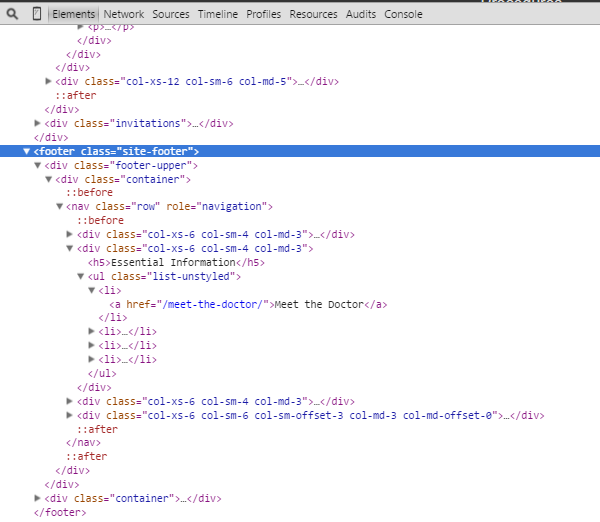
Have you looked at the underlying HTML and CSS? You can get the RELEVANT CSS from the browser's developer console.

footer.PNG

Seems like this site is using bootstrap too. So should be easy to replicate. Having said that - please don't just copy/paste - try to understand what's going on and write your own stuff.

I've seen it. But it was biult with the new Bootstrap version. And I'm using version 2.3.2. The "col-xs-6" or classes like that don't work.

Maybe try class="span6"

Be a part of the DaniWeb community

We're a friendly, industry-focused community of developers, IT pros, digital marketers, and technology enthusiasts meeting, networking, learning, and sharing knowledge.