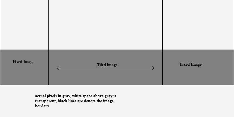
He is what im trying to do, ive got a logo that i want to place around the center of your screen over my semi-complex background that is set up like this...

[IMG]http://i11.photobucket.com/albums/a160/woody33/help.jpg[/IMG]
The "logo" image will be placed over the tiled image, but when the browser is shrinked because of a user using a smaller resolution, for example 1024x768, but the image would remain on the right side of the tiling area when it expands for a higher rez.

Just a push in the right direction to what css and/or html i should use to get the job done would help. I can post some of my own code too, if needed.

Dani AI

Generated

Quick summary and a focused fix based on the thread so far: already found the real culprit (the spacer GIFs had no height) after 's hint, and ' suggestion to separate CSS is a good housekeeping step. The remaining issue is layering a logo so it stays centered over the middle, repeat-x area regardless of viewport width.

Recommended approach (keeps the existing three-column layout but avoids fragile hacks):

  • Put a block-level wrapper inside the middle cell and make that wrapper the positioned ancestor.
  • Place the logo image as an absolutely positioned child of that wrapper and center it with a horizontal 50% + translate(-50%) trick so it remains centered as the middle column expands.
  • Use z-index to ensure the logo sits above the tiled background.

Example (place inside the center cell; this is a new snippet, not a copy of earlier code):

<td class="center-cell">
  <div class="center-wrap">
    <img src="ennovative.png" alt="logo" class="logo" />
  </div>
</td>

.center-cell, .center-wrap { position: relative; height: 104px; }
.logo {
  position: absolute;
  left: 50%;
  top: 50%;                 /* adjust if the logo should sit higher/lower */
  transform: translate(-50%, -50%);
  z-index: 100;
}

Notes and pitfalls:

  • For older browsers without CSS transforms, give the logo a known width and use left:50%; margin-left:-halfWidthpx; as a fallback.
  • Avoid vertical positioning with empty paragraphs; rely on cell/wrapper height and CSS.
  • Keep layout CSS separated in an external stylesheet, as suggested, for easier debugging.
  • If any stacking still misbehaves, confirm z-index on ancestor elements (only positioned elements participate in z-index stacking).

This centers the logo inside the flexible middle band and is robust across resolutions while staying compatible with the table-based structure already in use.

Recommended Answers

All 11 Replies

Can you post your code so we can see what you have already done?

<!DOCTYPE html PUBLIC "-//W3C//DTD XHTML 1.0 Transitional//EN" "http://www.w3.org/TR/xhtml1/DTD/xhtml1-transitional.dtd">
<html xmlns="http://www.w3.org/1999/xhtml">
<head>
<meta http-equiv="Content-Type" content="text/html; charset=iso-8859-1" />
<title>Untitled Document</title>
<style type="text/css">
<!--
.imagetest {
    background-image: url(swoosh_tile.png);
    background-repeat: repeat-x;
}
enn {
    left: 293px;
    top: 522px;
    z-index: 100;
    background-attachment: fixed;
    background-image: url(ennovative.png);
    background-repeat: no-repeat;
    background-position: 293px 522px;
    position: absolute;
}
body {
    margin-left: 0px;
    margin-top: 0px;
    margin-right: 0px;
    margin-bottom: 0px;
}
bg {
    z-index: 50;
}
-->
</style>
</head>

<body>
<p align="center">&nbsp;</p>
<table class="enn" width="335" border="0" cellspacing="0" cellpadding="0">
  <tr>
    <td></td>
  </tr>
</table>

<table id="bg" width="100%" border="0" cellpadding="0" cellspacing="0">
  <tr>
    <td background="swoosh_left.png" width="540" height="104">&nbsp;</td>
    <td class="imagetest" height="104">&nbsp;</td>
    <td background="swoosh_right.png"width="457"height="104">&nbsp;</td>
  </tr>
</table>

</body>
</html>

Might seem kinda "hodge-podge" or redundant in parts because i was kinda using trial and error to get this working.

first. separate the css of the document.

first. separate the css of the document.

Not sure what you mean...You can have your CSS and HTML all in one file. Do you mean seperate it so you can read it better?

Since you are using tables and not divs for this, here is an easy solution...

<table id="bg" width="100%" border="0" cellpadding="0" cellspacing="0">
  <tr>
    <td background="swoosh_left.png" width="540" height="104"><img src="resources/images/spacer.gif" width="540"></td>
    <td class="imagetest" height="104" width="100%">&nbsp;</td>
    <td background="swoosh_right.png"width="457"height="104"><img src="resources/images/spacer.gif" width="457" /></td>
  </tr>
</table>

Use a transparent gif to keep your outer cells at a fixed width and set your inner cell to 100% width.

If that is a background image set by css, add the following:

background-repeat: repeat-x;

This will make the image repeat horizontally, but not vertically.

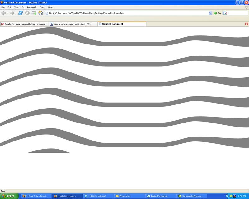
Strange, it still has problems witht the table being copied downward, but the it only tiles the "swoosh_tile" accross in the first one.

Do you think it has anything to do with the table not really having any height definition?

edit: here is my updated code:

<!DOCTYPE html PUBLIC "-//W3C//DTD XHTML 1.0 Transitional//EN" "http://www.w3.org/TR/xhtml1/DTD/xhtml1-transitional.dtd">
<html xmlns="http://www.w3.org/1999/xhtml">
<head>
<meta http-equiv="Content-Type" content="text/html; charset=iso-8859-1" />
<title>Untitled Document</title>
<style type="text/css">
<!--
.imagetest {
    background-image: url(swoosh_tile.png);
    background-repeat: repeat-x;
}
-->
</style>
</head>

<body>
<table width="100%" border="0" cellpadding="0" cellspacing="0">
  <tr>
    <td background="swoosh_left.png" width="540" ><img src="spacer.gif" width="540"></td>
    <td class="imagetest" height="104px" width="100%"></td>
    <td background="swoosh_right.png"width="457"><img src="spacer.gif" width="457" /></td>  
   </tr> 
</table>
</body>
</html>

No...it has to do with your image widths being set to 540 and 457. Lower those to something reasoable like 100 or 150 and you'll get the result you are looking for.

Ok, ive fixed the problem. It was the spacer images did not have a height value and were for some reason stretching the table far downwards. I set the height values of the spacer image to match that of the background images and it was fixed so that it works for both resolutions. Now my only problem is getting my logo image on top of that middle "stretched" area where it fits for both resolutions.

Be a part of the DaniWeb community

We're a friendly, industry-focused community of developers, IT pros, digital marketers, and technology enthusiasts meeting, networking, learning, and sharing knowledge.