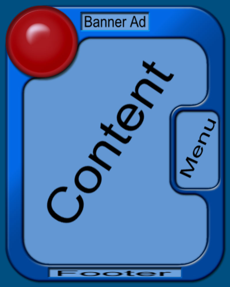
I got past my earlier jaggies issue :) and now I'm trying to decide on some colors. The one thing I would like to keep in this pic is the red circle, I'm open to changing other stuff though. What does everyone think? What colors should I use?

Dani AI

Generated

Keeping the red circle as the single saturated brand accent will make the design feel intentional rather than dated. That also answers ’s preference while following ’s suggestion to simplify—reduce heavy graphics, keep shapes flat, and let spacing and type do the work. was on the right track with tans and reds for a country-western vibe; use them as warm supporting tones, not competing brights. A color-mixer tool, as mentioned, is handy for iterating.

Practical starting palette (use as a baseline and tweak):

  • Background / large area: AntiqueWhite #FAEBD7
  • Panel / warm neutral: Tan #D2B48C
  • Deep wood / accents: SaddleBrown #8B4513
  • Primary accent (red circle, CTAs): FireBrick #B22222
  • Secondary accent (links / subtle contrast): SteelBlue #4682B4

Photoshop / styling tips to avoid "peach" tans: begin with a true tan hex like #D2B48C, then desaturate slightly rather than brightening. Add a very low-opacity Multiply layer filled with #8B4513 to introduce brown depth where shadows fall. If tans read too pink, reduce magenta in Selective Color (or lower Reds saturation) and add a touch of yellow/brown in shadows. A faint wood-grain or soft noise overlay at low opacity keeps flat color from feeling artificial.

Layout and accessibility notes: reserve the red circle for calls to action only; avoid using red for large backgrounds. Use a dark charcoal (#222222) for body text on warm backgrounds for legibility and a softer look than pure black. Keep gradients and heavy bevels minimal—clean type, consistent spacing, and subtle textures will modernize the look. For templates, store colors in CSS variables or a single stylesheet so tweaks are quick.

Recommended Answers

All 6 Replies

I think it looks a tad antiquated. May I ask what type of site this is for? I can't complain on the blues because they remind me of DaniWeb :)

Its for my site. The one in my sig. :) Oh yeah, I hope to turn this into a Mambo template...

Good choice with mambo. I've heard many good things about it. :) Still though, I think the big graphic-intensive design is a bit dated ... 2005 is all about clean lines and simplicity. At least I think so ;)

When I think Country Western Dancing, I think of tans and reds, flowing dresses on a wood floor, brown boots with silver buckles.

If you are looking to mix colors - this is one helluvagreat nice lil tool

--Tone

Hehe Dani I'm 32, I'm sooo livin in tha 90s :p

Tans, when I try to do tans in photoshop they always seem to come out peachy or just not tan :(

Yes I have da colormixer bookmarked, thanks :)

Be a part of the DaniWeb community

We're a friendly, industry-focused community of developers, IT pros, digital marketers, and technology enthusiasts meeting, networking, learning, and sharing knowledge.