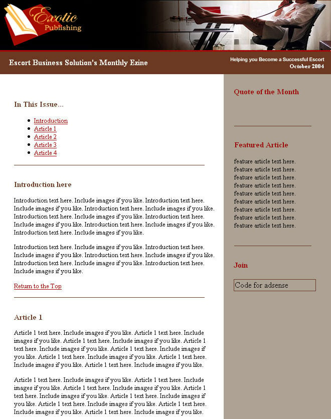
Hi all,
I hope I can upload a jpg here. I need help choosing colours that mesh with the top pic.
The brown just doesn't mesh w/ the glassy clean modern look.
What do you suggest?
Thanks for any help you can give me :)
Thanks
Michelle
Hi all,
I hope I can upload a jpg here. I need help choosing colours that mesh with the top pic.
The brown just doesn't mesh w/ the glassy clean modern look.
What do you suggest?
Thanks for any help you can give me :)
Thanks
Michelle
A clean, glassy header reads cool, reflective and high-key. The brown in the current template feels heavy against that language, which is why found it at odds with the image. 's orange idea is energetic but will push the palette warm; 's pointer toward a color mixer is on the right track. A simpler, longer‑lasting approach is to base the template on neutral, cool tones and use one desaturated bright for accents.
Practical starting palettes (swap in sampled tones from the image):
:root {
--bg: #F5F7FA; /* very light cool neutral */
--card: #E6EEF3; /* subtle panel for glass effect */
--text: #2C3E50; /* charcoal-blue for readable copy */
--accent:#00A7C4; /* cool cyan/teal for links and CTAs */
} Use the accent sparingly: links, buttons, and small icons.
Simple workflow that stays faithful to the image
background: rgba(255,255,255,0.6)) and a light blur or soft shadow for depth.Quick cautions: check body text contrast against background (keep comfortable readability), test on small screens, and avoid using bright warm accents as dominant colors. The thread's colormixing suggestion is useful—sampling directly from the image and then adjusting saturation/brightness will produce the most cohesive result.
Jump to Post— DaveSW 15I'm not seeing anything in the thumbnails bit...
edit: ahh it's just appeared...
How about oragne, (probably not) or a complete break, blue, pink...
I'm not seeing anything in the thumbnails bit...
edit: ahh it's just appeared...
How about oragne, (probably not) or a complete break, blue, pink...
LOL, I don't think so.
I need colours that match the image & still maintain the classy, clean glassy proff. look of the image.
Thanks
Michelle
I'm not seeing anything in the thumbnails bit...
edit: ahh it's just appeared...
How about oragne, (probably not) or a complete break, blue, pink...
Have you looked at this ?
We're a friendly, industry-focused community of developers, IT pros, digital marketers, and technology enthusiasts meeting, networking, learning, and sharing knowledge.