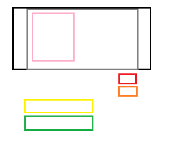
help with divs plz/ iam trying this for while but no luck.

<div id='bg'>
    <div id ='contect'>
        <div id='image_left'>
        </div>
        <div id='image_right'>
        </div>
        <div id='image_right2''>
        </div>
        <div id='image_middle>
        </div>
        <div id='image_bottom'>
        </div>
        <div id='image_comment'>
        </div>
    </div>
</div>


#bg4 {
    background:-webkit-gradient( linear, left top, left bottom, color-stop(0.05, #b1b7b6), color-stop(1, #CCC) );
    border:2px solid black;
}
#context4 {
    width: 1202px;
    margin: 0 auto;
    background:#CCC;
    border:2px solid gray;
}

#image_left
{
    float:left;
    border:2px solid pink;
}
#image_right
{
float:right;
border:2px solid red;
}
#image_right2
{
float:right;
clear:both;
border:2px solid orange;
}
#image_medium
{
    float:left;
    clear:both;
    border:2px solid yellow;
}
#image_bottom
{
border:2px solid green;
float:left;
clear:both;
}
#image_comment
{
    float:left;
    clear:both; 
}

//here is what iam trying to do
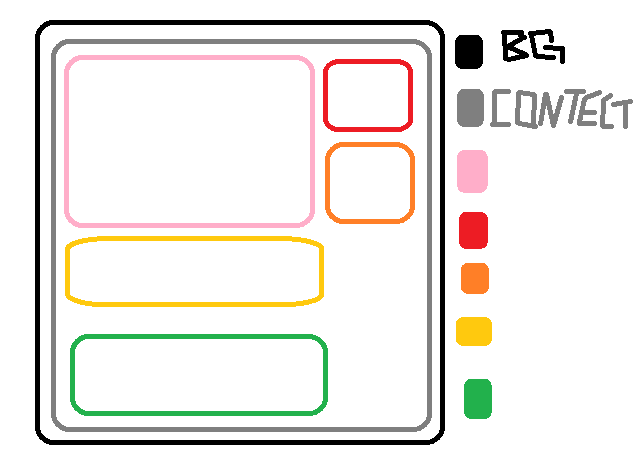
div1

//here is what this code does :(
wdiv

Dani AI

Generated

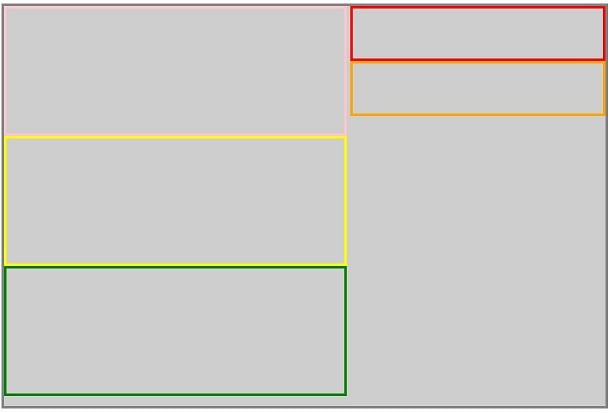
Quick diagnosis: the layout failures were mostly caused by simple typos and by clearing every floated box. Notable problems in the posted snippets include mismatched selector/ID names (#bg vs #bg4, contect vs #context4), stray or missing quotation marks on id attributes, and use of clear:both on almost every element (that forces stacking). was right that giving floats explicit widths helps, but the ID/attribute issues must be fixed first.

Fast fixes to make the float-based approach behave:

  • Make sure each HTML id exactly matches the CSS selector.
  • Give floated elements a width (percent or px).
  • Make the parent contain its floats (either add a clearfix or set overflow:auto on the parent).
    Example clearfix to add to the parent container:
    .clearfix::after {
    content: "";
    display: table;
    clear: both;
    }

    Apply .clearfix to the wrapper so floated children don’t collapse it.

A more robust, modern option is to replace the float layout with Flexbox (simpler, responsive, and avoids manual clears). Minimal example:

.container { max-width:1200px; margin:0 auto; }
.top { display:flex; gap:16px; align-items:flex-start; }
.left { flex:2; }
.right { flex:1; }
.stack { margin-top:16px; } /* middle / bottom sections */

Other practical notes: avoid fixed pixel heights unless content is guaranteed; use box-sizing:border-box; make images max-width:100% so they scale; validate HTML to catch stray quotes. The screenshot from confirms the intended column proportions; once IDs and widths are fixed, ’s floated solution will render correctly — but Flexbox is recommended for maintainability.

You had some typos in your example. Basically, you were on the right track. Just as I mentioned in the other thread that you had, you needed to add some widths and heights to the divs. Then use the floats and clears to ensure the divs are placed in the correct locations. Here is an example, you can modify the code to your needs.
Capture23

<html xmlns="http://www.w3.org/1999/xhtml">
<head runat="server">
<title></title>
<style type="text/css">
#bg4 {
    background:-webkit-gradient( linear, left top, left bottom, color-stop(0.05, #b1b7b6), color-stop(1, #CCC) );
    border:5px solid black;
    width:1205px;
    height:500px;
}
#contect {
    width: 1202px;
    margin: 0 auto;
    background:#CCC;
    border:5px solid gray;
    height:800px;
}
#image_left{
    float:left;
    border:5px solid pink;
    width:675px;
    height:250px;
}
#image_right{
float:right;
border:5px solid red;
    width:500px;
    height:100px;
}
#image_right2{
float:right;
clear:right;
border:5px solid orange;
    width:500px;
    height:100px;
}
#image_middle{
    float:left;
    clear:both;
    border:5px solid yellow;
    width:675px;
    height:250px;
}
#image_bottom{
    border:5px solid green;
    float:left;
    clear:both;
    width:675px;
    height:250px;
}
#image_comment{
    float:left;
    clear:both; 
}

</style>
</head>

<body>
<div id="bg">
    <div id ="contect">
        <div id="image_left">
        </div>
        <div id="image_right">
        </div>
        <div id="image_right2">
        </div>
        <div id="image_middle">
        </div>
        <div id="image_bottom">
        </div>
        <div id="image_comment">
        </div>
    </div>
</div>
</body>
</html>
Be a part of the DaniWeb community

We're a friendly, industry-focused community of developers, IT pros, digital marketers, and technology enthusiasts meeting, networking, learning, and sharing knowledge.