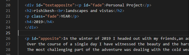
hello everybody, this is my code how can I show (div and p) apposite to each other by using css?
Both and offered valid approaches (floats and absolute positioning). Those work but have tradeoffs: floats need clearing and can be fragile for layout, while absolute positioning usually requires a known height. A more robust and future-proof solution is to use modern layout tools like Flexbox or Grid; they center vertically without hacks and adapt well to responsive screens.
A simple Flexbox pattern that keeps a div and a p side-by-side and vertically centered:
<div class="row">
<div class="left">Left block</div>
<p class="right">Right paragraph</p>
</div>
.row {
display: flex;
align-items: center; /* vertical centering */
justify-content: space-between; /* push items to ends */
gap: 1rem;
}
p { margin: 0; } /* reset default paragraph margin that often breaks alignment */ For explicit column sizing or more complex placement, CSS Grid is an alternative (use grid-template-columns to control widths and align-items to center). For small screens, add a media query to stack the items (flex-wrap or change grid to a single column). Preserve logical DOM order for accessibility; visual reordering can confuse keyboard and screen-reader users unless handled carefully.
References: Flexbox basics and CSS Grid layout.
Jump to Post— Dani 5,664Something like this:
div#textapposite { float: left; width: 50%; } p#apposite { float: right; width: 50%; }
Something like this:
div#textapposite { float: left; width: 50%; }
p#apposite { float: right; width: 50%; } If you know the height of the div you want vertically centered, one trick you can use is absolute or relative positioning with a negative top margin as so:
.header_first_above .first_above .icons {
position: relative;
top: 50%;
height: 150px;
margin-top: -75px;
We're a friendly, industry-focused community of developers, IT pros, digital marketers, and technology enthusiasts meeting, networking, learning, and sharing knowledge.