Hi,

is there an easy way to wrap text around an odd-shaped image?

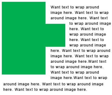
Please refer to attached image. I need text to float around the green image but the image isn't perfectly symmetrical.

Any tips would be much appreciated.

I've tried googling but have had no luck. Maybe I'm not googling the right search words.

It must be possible without being overly complex using css??
Dani AI

Generated

A much cleaner solution than slicing or fiddly per-line spans is to use the CSS Shapes feature so the browser can wrap text to a non-rectangular outline instead of treating the image as a plain rectangle. This keeps the image in normal document flow (so alt text and semantics stay intact) and avoids brittle pixel-placement hacks that break across resolutions — a point already hinted at by and demonstrated by 's background/spans workaround.

Two practical approaches (example CSS):

/* use the image's alpha channel as the flow shape */
.float-shape {
  float: left;
  width: 220px;
  shape-outside: url('green-shape.png');
  -webkit-shape-outside: url('green-shape.png');
  shape-margin: 12px;        /* space between shape and text */
  margin: 0 12px 12px 0;
}

/* or define a shape with polygon (precise control, useful when tracing a path) */
.float-geo {
  float: left;
  width: 220px;
  shape-outside: polygon(0% 0%, 85% 10%, 100% 50%, 85% 90%, 0% 100%);
  clip-path: polygon(0% 0%, 85% 10%, 100% 50%, 85% 90%, 0% 100%);
}

Notes and practical tips: prefer an actual <img> (with a proper alt) for content images rather than a background image so accessibility is preserved. shape-outside controls text flow; clip-path controls visual clipping — use both when the visual cut must match the wrapping. Browser support varies, so provide a simple fallback (fixed margin or float with a rectangular flow) inside a feature query:

@supports not (shape-outside: circle(50%)) {
  .float-shape { margin-right: 16px; }
}

For very complex outlines, export an SVG path or generate polygon points from a vector editor to feed shape-outside or clip-path. As suggested, test across browsers and viewport sizes — shape definitions and shape-margin are the easiest levers to tune for responsive behavior.

Recommended Answers

All 3 Replies

No, because all images are really rectangles. The rest of that image is transparent. But the browser has no idea where the content is within the rectangular image.

I have some ideas:

1. Cut the image in two. But placement is tricky.

2. If the image is really solid green like that, you could make it with table components.

3. Put the text in a larger image containing both.

Thanks for your suggestions MidiMagic.

I tried option 1. Placement was very tricky and eventually I gave up on this option.

Unfortunately the image is not solid green.

I had thought about option 3 but prefer to avoid this option.

I ended up using the image as a background and putting each line of text into a span with left padding. Not exactly pretty html but it gets the job done whilst keeping it to 1 image without text in the image.

Don't ask me about alt and title text for the background image though :)

If anyone is interested I also just found the following url which talks about slicing up the image for curving and wrapping the text around it...

You ought to check that span method on other browsers and screen resolutions. The text positioning might change drastically.

Be a part of the DaniWeb community

We're a friendly, industry-focused community of developers, IT pros, digital marketers, and technology enthusiasts meeting, networking, learning, and sharing knowledge.