Hi,

I have this navigation:

page-about.php

<div id="AboutNav">					
		<h3>About</h3>
            <p style="border-bottom: 1px dotted #787878; width: 200px;"></p><br /> 
				                
                	<a href="https://localhost/wordpress/about/about-vision.php">Vision & Mission</a>
                	<a href="https://localhost/wordpress/about/about-history.php">History</a>
                	<a href="https://localhost/wordpress/about/about-client.php">Client</a>
                    <a href="https://localhost/wordpress/about/about-people.php">People</a>   

                 <li>  <a href="https://localhost/wordpress/about/about-people.php">Chairman</a></li>       
                 <li>  <a href="https://localhost/wordpress/about/about-people.php">Partners</a></li>          
                 <li>  <a href="https://localhost/wordpress/about/about-people.php">Director</a></li>          
                 <li>  <a href="https://localhost/wordpress/about/about-people.php">Advisors</a></li>          
                 <li>  <a href="https://localhost/wordpress/about/about-people.php">Senior Lawyers</a></li>  
                 <li>  <a href="https://localhost/wordpress/about/about-people.php">Junior Lawyers</a></li>  
                 <li>  <a href="https://localhost/wordpress/about/about-people.php">Secretariat</a></li>          
                 <li>  <a href="https://localhost/wordpress/about/about-people.php">Librarians</a></li>                        
            
<br>
</div><br />

http://ocklaw.com/new/about/

Can anyone help me fix the navigation. My point is this: 1) only when somebody press the people's navigation bottom then a list of people's position appears, otherwise, they should be hidden.

2) the grey background suppose to fill behind the list bottom also, yet the list bottom must remains black color on hover eventhough the text turns red on hover.

How to do these things ?

This is the css file by the way:

style.css

#AboutNavBox{
	background-color: #d1d2d4;
	width: 207px;
	height: 200px;
	}

#AboutNav a:link{
	background: url('images/About/AboutNav2.png') 0 0;	
	width: 197px;
	height: 32px;
    text-decoration: none;
	color: black; Arial, Helvetica, sans-serif;	
	font-size: 12px;
	display: block;
	}	

#AboutNav a:visited{
	background: url('images/About/AboutNav2.png') 0 95px;	
	width: 197px;
	height: 32px;
    text-decoration: none;
	color: black; Arial, Helvetica, sans-serif;	
	font-size: 12px;
	display: block;
	padding-left: 10px;
	}		

#AboutNav a:hover{
	background: url('images/About/AboutNav2.png') 0 64px;	
	width: 197px;
	height: 32px;
	text-decoration: none;
	color: red; Arial, Helvetica, sans-serif;	
	font-size: 12px;
	display: block;
	}

Dani AI

Generated

Short checklist and a compact solution that ties , and suggestions together.

Fixes you need first

  • Clean the HTML: each &lt;li&gt; must be inside a single &lt;ul&gt; (remove stray &lt;br&gt; and duplicated/malformed anchors).
  • Don’t use a fixed height on the nav container — let it expand when the submenu opens (this is why the grey background stopped at the wrong place).
  • To keep bullets visible while anchors are block-level, set the list-style inside the anchor area or draw the bullet with ::before.

Example markup (replace your current block with this structure)

<nav id="AboutNavBox">
  <h3>About</h3>
  <ul id="AboutNav">
    <li><a href="/about-vision.php">Vision & Mission</a></li>
    <li><a href="/about-history.php">History</a></li>
    <li class="has-submenu">
      <a href="/about-people.php">People</a>
      <ul class="submenu">
        <li><a href="/about-people.php#chairman">Chairman</a></li>
        <li><a href="/about-people.php#partners">Partners</a></li>
        <!-- more items -->
      </ul>
    </li>
  </ul>
</nav>

CSS essentials (keeps grey background, shows bullets, makes hover background black while text turns red)

#AboutNavBox { background:#d1d2d4; width:220px; padding:10px; box-sizing:border-box; }
#AboutNav { margin:0; padding:0; }
#AboutNav ul { list-style:disc inside; margin:0; padding-left:0; }
#AboutNav a { display:block; padding:8px 10px; color:#000; text-decoration:none; }
#AboutNav a:hover { background:#000; color:red; }
.submenu { display:none; }
.has-submenu.open > .submenu { display:block; }
.has-submenu > a::after { content: ">"; float:right; }
.has-submenu.open > a::after { content: "v"; }

Small jQuery to toggle the submenu and arrow (as suggested using jQuery)

$('#AboutNav .has-submenu > a').on('click', function(e){
  e.preventDefault();
  var $li = $(this).parent();
  $li.toggleClass('open').find('> .submenu').stop(true,true).slideToggle(180);
  $li.siblings('.open').removeClass('open').find('> .submenu').slideUp(180);
  $li.attr('aria-expanded', $li.hasClass('open'));
});

Troubleshooting pointers

  • If bullets still disappear, set list-style-position: inside; or render bullets with li::before.
  • Remove fixed heights and test in narrower viewports (see ).
  • Add aria-expanded/keyboard support for accessibility.

Recommended Answers

All 6 Replies

I don't see a AboutNavBox id in your code, so I think you'll have to remove the 'Box' from the id in your css code.
There are numerous free to use jQuery scripts that do this sort of tasks for you.
are you looking for something like this?

oh sorry. it suppose to be like this:


page-about.php

div id="AboutNavBox">
<div id="AboutNav">					
		<h3>About</h3>
            <p style="border-bottom: 1px dotted #787878; width: 200px;"></p><br /> 
				                
                	<a href="https://localhost/wordpress/about/about-vision.php">Vision & Mission</a>
                	<a href="https://localhost/wordpress/about/about-history.php">History</a>
                	<a href="https://localhost/wordpress/about/about-client.php">Client</a>
                    <a href="https://localhost/wordpress/about/about-people.php">People</a>       
                    
                 <li>  <a href="https://localhost/wordpress/about/about-people.php">Chairman</a></li>       
                 <li>  <a href="https://localhost/wordpress/about/about-people.php">Partners</a></li>          
                 <li>  <a href="https://localhost/wordpress/about/about-people.php">Director</a></li>          
                 <li>  <a href="https://localhost/wordpress/about/about-people.php">Advisors</a></li>          
                 <li>  <a href="https://localhost/wordpress/about/about-people.php">Senior Lawyers</a></li>  
                 <li>  <a href="https://localhost/wordpress/about/about-people.php">Junior Lawyers</a></li>  
                 <li>  <a href="https://localhost/wordpress/about/about-people.php">Secretariat</a></li>          
                 <li>  <a href="https://localhost/wordpress/about/about-people.php">Librarians</a></li>          


            <br>
</div><br />                               
</div>

style.css

#AboutNav ul{	
	list-style-type: circle;
	}
	
#AboutNav li a:link{
	background: url('images/About/AboutNav2.png') 0 0;	
	width: 197px;
	height: 32px;
    text-decoration: none;
	color: black; Arial, Helvetica, sans-serif;	
	font-size: 12px;
	display: block;
	}	

#AboutNav li a:visited{
	background: url('images/About/AboutNav2.png') 0 95px;	
	width: 197px;
	height: 32px;
    text-decoration: none;
	color: black; Arial, Helvetica, sans-serif;	
	font-size: 12px;
	display: block;
	padding-left: 10px;
	}		
	
#AboutNav li a:hover{
	background: url('images/About/AboutNav2.png') 0 64px;	
	width: 197px;
	height: 32px;
	text-decoration: none;
	color: red; Arial, Helvetica, sans-serif;	
	font-size: 12px;
	display: block;
	}
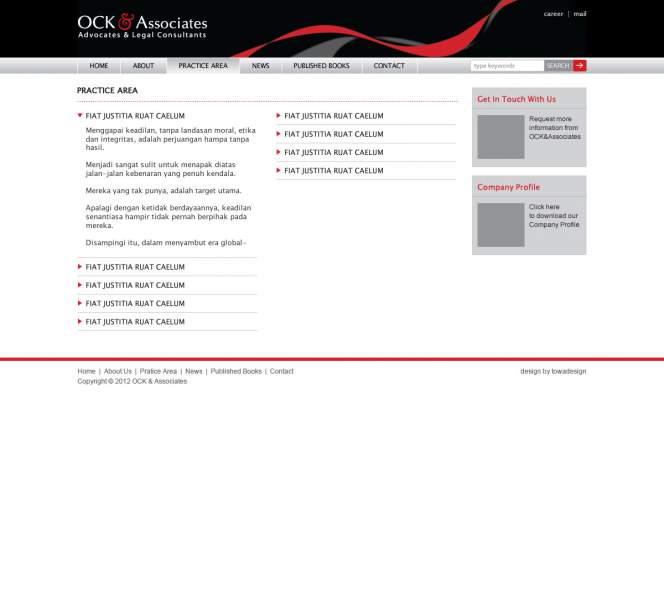
Now, the bullet disappeared.

Can you give the proper full url to the test page.

On going to the link
http://ocklaw.com/new/about/
a few things struck me.

This may come as a surprise to you, but my screen may not be the same size as yours, and my browser isn't running full screen. So the text on the right sits over the links on the left. It gets sorted when I drag the browser window wider, over onto part of my second screen. So stop designing with your browser full screen, and test things at smaller screen / viewport sizes than you use. Because the page breaks in smaller viewports than 1400px width.

Next, the code published above and on that page where the link takes us has some obvious errors in it.

First you have some links that are not in an ordered list and then you have some that are meant to be in an ordered list - we can see the <li> and </li> tags. What we can't see is the <ul> and </ul> tags...

Next your footer is stuck over on the right of the screen, caught on the edge of one of the other divs.

You need to add clear:both; to the #footer-container to stop that happening.

Next there is a paragraph which is empty and has a border of a dotted red line. Why?
This should be the border-bottom of the h4 tag that the header Client sits in, or in an extreme case, the border-top of the div below that, the .post div.

Also at the bottom of the page is a div inside the footer called #body - it is a VERY bad idea to use a reserved word for an id or class name, it can lead to confusion when we tell you to alter some code.

Finally, #footer-container, and #footer-nav are the exact same size, so one of them is not needed and its styles should be in the other one. #body, inside #footer-nav might not be needed either with a small adjustment to your code.

I think things will be easier if you implement some of the changes I've given.

Please re-check:

http://ocklaw.com/new/about/

How to create a bullet navigation list with the same background as in the linked ?

I don't see a AboutNavBox id in your code, so I think you'll have to remove the 'Box' from the id in your css code.
There are numerous free to use jQuery scripts that do this sort of tasks for you.
are you looking for something like this?

I am getting close. Just one more thing, is it possible to create drop down box that the navigation arrow turns " v " upon click, Otherwise it remains " > "

Check the attachment. Thanks.

Be a part of the DaniWeb community

We're a friendly, industry-focused community of developers, IT pros, digital marketers, and technology enthusiasts meeting, networking, learning, and sharing knowledge.