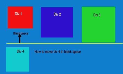
<div class="container">
    <div class="Div1"></div>
    <div class="Div2"></div>
    <div class="Div3"></div>
    <div class="Div4"></div>
</div>

.container{
    position:relative; display:block; float:left; width:100%;
  padding-right: 15px;
  padding-left: 15px;
  margin-right: auto;
  margin-left: auto;}

.div1{width:33%; height:auto; position:relative; display:block; float:left;}
.div2{width:33%; height:auto; position:relative; display:block; float:left;}
.div3{width:33%; height:auto; position:relative; display:block; float:left;}
.div4{width:33%; height:auto; position:relative; display:block; float:left;}

Dani AI

Generated

Quick practical checks first. Make sure the CSS selectors actually match the HTML (for example Div1 vs div1) so your rules are applied. Also remember that floated elements flow left-to-right and will “fill” the first available space when heights differ — that behavior is what creates the black gap and the unpredictable placement of Div4.

As alternatives to the float approach:

Use CSS Grid for explicit placement (no JS, predictable layout). Keep your HTML order and add rules that pin items to columns/rows:

/* add to your stylesheet */
.container {
  display: grid;
  grid-template-columns: repeat(3, 1fr);
  gap: 12px;
}
.Div1 { grid-column: 1; grid-row: 1; }
.Div2 { grid-column: 2; grid-row: 1; }
.Div3 { grid-column: 3; grid-row: 1; }
.Div4 { grid-column: 1; grid-row: 2; }

Group into explicit column wrappers (no repositioning hacks). This keeps content stacked in each column and is robust if you control HTML:

<div class="container">
  <div class="col">
    <div class="Div1">…</div>
    <div class="Div4">…</div>
  </div>
  <div class="col"><div class="Div2">…</div></div>
  <div class="col"><div class="Div3">…</div></div>
</div>
.container { display: flex; gap: 12px; }
.col { flex: 1; display: flex; flex-direction: column; gap: 12px; }

Notes tied to earlier replies: correctly pointed out Masonry for a JS-driven masonry packing; that is useful if you want automatic packing without changing markup. ’s suggestion to alter display can work but changes flow and ordering. If you must keep floats, forcing clear: left on Div4 will push it beneath the first column but is less flexible than grid or column wrappers.

Recommended Answers

All 2 Replies

Member Avatar for Member #120589

This would be difficult without js, even with CSS3. You can do it with to an extent with inline-block as display as use columns, but the results aren't always what you'd expect, as they don't go div1->4 in order - with your current heights, you'd probably get div2 dropping directly below div1 (no gap). Have a look at Masonry - http://masonry.desandro.com/ it may help.

seem like the size of div4 is high, and if move to below the div 1, overall height is not equivalent.

To move the div 4 under div 1, using

display: inline;

and the size of div 1 and div 4 should change, it should be display in this way div 1-> div 4-> div 2 -> div 3

Be a part of the DaniWeb community

We're a friendly, industry-focused community of developers, IT pros, digital marketers, and technology enthusiasts meeting, networking, learning, and sharing knowledge.