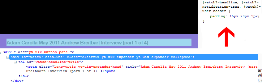
I decided the best way to learn css was to try to recreate pages of web sites. I chose youtube, because the layout seemed challenging but doable from a noobie perspective, and I get to watch youtube vids in the process. I am having trouble recreating the part under the videos where there is the title, information about the poster and the likes/displikes bar. I don't have trouble getting the divs to align properly on a separate test page.I added div {border:1px;border-style:solid;border-color:red;} to the css page to see what is going on and aside from rogue unaccounted for divs on my page I don't know whats going on. I'm just gonna upload a zip file of what I have because the code is kinda long:

What I have:
Screen_shot_2013-01-09_at_4.33_.16_AM_

Youtube:

Screen_shot_2013-01-09_at_4.41_.50_AM_

Now, I realize a lot of elements on the youtube page aren't actual hard-coded elements on the page but objects drawn or generated by javascript or something, but I'm just going for look-alike

so yeah its a run of the mill "2 divs floating left and right". In a sub-container. The width of both the container is hard coded to 630, the width of the movie place-holder image and the left and rights divs representing the name and the like/dislike stat bar is 250 and 205 respectively. I made a simpler html test page with a simplified version, that worked fine, but the youtube remake has tons of divs and its hard to isolate the problem. when I put overflow:scroll; for the container it works except, you know, theres a scroll bar. I don't know what I'm doing wrong.

Recommended Answers

All 7 Replies

Hi dancks,
Nice undertaking! Best way to learn in my opinion.
Your code is only using width: 630px for the containing divs. There's nothing to push the inside elements/divs away from the walls of their respective containers. On the YouTube page, they are using paddings on the containers to push the inner divs inside more. See screenshot (the purple is the padding).
Try changing the style on #content-under-title to width: 590px; padding: 0 20px;. This may help you move in the right direction. Remember that when you add padding, you have to subtract an equal value from the width. So in adding 40px of padding (20 left, 20 right) we must reduce the width: 630 - 20 - 20 = 590.

Sorry for responding so late. The 2 divs in question are in the proper place now with the padding, the avatar for the comments are still acting crazy and floating out of place. I'm confused as to the algorithm browsers use as to what happens to overflowing divs, and where overflowing content should be placed.

Screen_shot_2013-01-10_at_3.43_.58_AM_

dancks, great idea for learning!

About floating divs... I hate it! I just think it's too much pain to use it, if you forget to use clean after the headache will be huge.

Because of that I ended up using a custom css class to make elements inline:

.inline
{
    position: relative;
    display: -moz-inline-stack;
    display: inline-block;
    zoom: 1;
    vertical-align: top;

    *display: inline;
}

And the use is like this:

<div class="inline">
    <img src="..."/>
</div>
<div class="inline">
    bla bla bla bla bla bla bla
</div>

Hope it helps

Kinda fixed it:

Screen_shot_2013-01-10_at_11.43_.21_AM_

now I gotta fix that huge spacing.

I just did:

<div id="comments">
    <!-- begin 1 -->
        <div class="comment">
            <div style="float:left;width:50px;"><img src="photo.png" /></div>
            <div style="float:right;width:500px;position:relative;top:-15px;">
                <p class="nick">ExampleNick</p>
                <div>
                    <p style="font-size:12px;line-height:100%;">You can always count on people to complain about something... its as sure as the sun coming up in the morning, and setting at night. Does it make you feel better as a person to complain and insult the work someone does as a tribute? I think if it does, your a sad and unhappy person, that will never be anything more then just that.... I think you did a great job on the video... thanks for the work you put into it</p>                    
                </div>
            </div>
        </div>
    <!-- end 1 -->
            ...
</div>

relevant css:

#comments {
    width:630px;
    border-color:#F00;
    margin:10px;
    display:block;
}
.comment {
    float:left;
    width:590px;
    width:90%;
    padding:19px;
    display:table;
    overflow:hidden;
}

I don't even know if overflow:hidden or display:table did anything. I gotta play with it more.

@AleMonteiro:

I tried this quick test with your code and it didn't line up correctly (but stuff didn't just float away so theres that. I don't know if this setup is what you were suggesting:

<!DOCTYPE html PUBLIC "-//W3C//DTD XHTML 1.0 Transitional//EN" "http://www.w3.org/TR/xhtml1/DTD/xhtml1-transitional.dtd">
<html xmlns="http://www.w3.org/1999/xhtml">
<head>
<meta http-equiv="Content-Type" content="text/html; charset=UTF-8" />
<title>Comment test</title>
<link rel="stylesheet" href="youtube.css" type="text/css" />
<style type="text/css">
    .inline
    {
    position: relative;
    display: -moz-inline-stack;
    display: inline-block;
    zoom: 1;
    vertical-align: top;
    *display: inline;
    }
</style>
</head>
<body>
<div id="comments">
<div class="inline">
    <img src="photo.png" />
</div>
<div class="inline">
    <p>ExampleNick</p>
    <p>
    Content. Content. Content. Content. Content. Content. Content. Content. Content. Content. Content. Content. Content. Content. Content. Content. Content. Content. Content. Content. Content. Content. Content. Content. Content. Content. Content. Content. Content. Content. Content. Content. Content. Content. Content. Content. Content. Content. Content. Content. Content. 
    </p>
</div>
</div>
</body>
</html>

Just a last tip: If you're using FireFox, you should be using the Firebug extension. It will make your life much easier. Hovering over elements in its HTML panel will show you the element's size in blue, the padding in purple, and margin in yellow. The right-side Styles panel will show you all the CSS affecting the element. Very helpful for debugging and finding out where extra spacing is coming from.

When you use float property, you must be very careful and should specify all floating elements inside its own area. Create it as if each float area is a row of display content.

<style type="text/css">
 div.float_container {
   position: relative;
   width: 100%;
 }
 div.clear_float {
   clear: both;  /* clear both floating left & right */
   height: 1px;
   color: transparent;
 }
 div.float_left {
   float: left;
 }
 div.float_right {
   float: right;
 }
</style>

<body>
...
 <div class="float_container">
   <div class="float_left">
   Float to the left 1
   </div>
   <div class="float_left">
   Float to the left 2
   </div>
   <div class="float_right">
   Float to the right
   </div>
   <div class="clear_float">&nbsp;</div>
 </div>

 <div class="float_container">
   <div class="float_left">
   Float to the left 1
   </div>
   <div class="float_left">
   Float to the left 2
   </div>
   <div class="float_right">
   Float to the right
   </div>
   <div class="clear_float">&nbsp;</div>
 </div>
...
</body>

Now there is still a problem with 2 float elements that float to the same direction (left or right) because if the height of the first element which floats to that direction is very short, the second float may float right under the first element. If you have only 1 float to the left and 1 float to the right, then it is fine.

PS: If you are using Firefox, you should also install Webdeveloper plug-in. It can display borders of each element (div, table, etc).

dancks,

sorry, I forgot to mention that the .inline class only work with divs that have the width explicit set.

Be a part of the DaniWeb community

We're a friendly, industry-focused community of developers, IT pros, digital marketers, and technology enthusiasts meeting, networking, learning, and sharing knowledge.