google-chrome-sign.jpg

By most accounts, the transition to Material Design has been a successful one for Android. It’s more responsive, it’s easier on the eyes and it’s even made its way over to iOS to some degree. So it only makes sense that Google would take what it’s learned from Android and implement the best elements in the Chrome browser.

On Friday, The Next Web discovered a which appears to suggest that the first Material Design alterations to Chrome will begin appearing in Chrome OS with the launch of version 50.

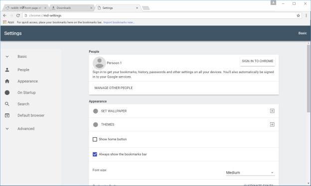
By enabling certain ‘flags’ in the Settings menu, The Next Web was able to see a few of the changes early. Although the changes aren’t going to turn the world upside-down, they’re a good indication of the direction Google is moving in 2016.

For example, tabs have sharp edges rather than rounded ones, the menu button on the right side of the address bar has been converted from three lines into three dots, and many of the other buttons have been visually refreshed as well.

Other changes include a better scrolling bar, and redesigned pages for Downloads, Extensions, Settings and History. The new Settings page is especially pleasant to look at:

chrome-incognito.png
chrome-settings.png

There doesn’t appear to be a set release date for any of these features or visual upgrades, but considering the fact that many of them are already available to PC and Chrome OS users (providing they’re willing to do a little digging), it seems likely that some of the updates will begin to appear in the next versions of Chrome released to the public. !!

Dani AI

Generated

The screenshots posted by open a useful conversation about trade‑offs in browser UI updates rather than just a cosmetic story. Modern design systems aim for clarity, consistent touch targets and simpler visual hierarchy. That often improves accessibility and makes controls easier to scan on touch devices, but it also reduces information density and changes familiar visual cues that long‑time users rely on.

’s point about cross‑browser similarities is expected: successful patterns tend to be adopted across engines. ’s concern about wasted screen space is also valid — on small laptops or when dozens of tabs are open, every pixel counts. The real question for most workflows is whether the change improves task efficiency (finding the right tab, discovering controls) or just makes the chrome look “cleaner.”

Practical, low‑risk ways to preserve productivity while updates roll out:

  • Keep frequently used pages pinned so the tab strip shows favicons only.
  • Rely on keyboard navigation (for example, Ctrl+1..9 and Ctrl+Tab / Ctrl+Shift+Tab) to jump between tabs quickly.
  • Where available, use tab management features (tab groups, vertical/tab‑search interfaces) or reputable extensions that present tabs vertically.
  • Replace long tab sessions with bookmark folders or a session manager to reduce active clutter.
  • Test major UI changes in a secondary profile and verify critical extensions still behave as expected before making them permanent.

A final note on community practice: since this thread touched on reposted material, always include clear attribution and the original source when sharing others’ articles or screenshots. That keeps discussions focused on usability and prevents the moderation issues flagged.

Recommended Answers

All 3 Replies

Seems that they are taking some visual clues from Mozilla / Firefox. :-)

Smells like spam. The article appears to have been scraped from another site, with the addition of a link on the words 'brand new icons'. Please feel welcome to correct me if I'm wrong.

See: http://bgr.com/2016/01/31/google-chrome-material-design-update/
Is this the original? It seems to be copyright material. Did you obtain permission?

Please do give authors proper attribution if the work is not your own.

Please be aware of Daniweb's rules, specifically the posting of editorials already published on another site.

On a positive note, thank you for bringing the article to our attention - it's mostly relevant, and welcome to the forum :-)

Wow, angled tabs. Amazing.

Call me a luddite but when you have a dozen tabs open on a netbook, square tabs are the way to go! Rounded and angled tabs just waste valuable screen space.

Be a part of the DaniWeb community

We're a friendly, industry-focused community of developers, IT pros, digital marketers, and technology enthusiasts meeting, networking, learning, and sharing knowledge.