I wasnt sure where to put this. Its a PHP script but i am running CentOS on a VPS. I have a feeling it could be an encoding problem which is why i put it here.

On the website the videos look great, and plays perfect but when i view it on the phone, the site itself is responsive but the videos arent and they are "grayed out" so to speak as you can see in the pictures. When i click on the video it brings me to the original source where embedded from.

Im using AVS 3.0

Here are a couple of pictures from the phone to show the issues

This happens only when its embedded from one specfic website:

Happens when i click on a video:
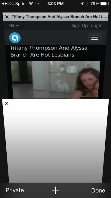
unnamed_(1).png

If you look at the play button area its "grayed out"


unnamed.jpg

Dani AI

Generated

As described, the page and desktop playback work but the same embeds appear “grayed out” on a phone and tapping them opens the original host. That pattern (only one provider affected, mobile-only) strongly points at the embed itself or how the provider serves the player on mobile, rather than a general responsive-layout bug. ’s suggestion to involve AVS support is reasonable, but a few concrete checks and quick fixes can be done first.

Common diagnostic steps and what to look for

  • Inspect the embed markup in the page source. If the snippet uses <object>/<embed> or references a .swf, that is Flash-based and will fail on most phones.
  • If the embed is an <iframe>, check for hard-coded width/height or inline styles that prevent scaling.
  • Check headers from the provider (X-Frame-Options or CSP frame-ancestors). Those headers can block embedding; use curl -I 'SOURCE_URL' and look for X-Frame-Options / Content-Security-Policy.
  • Emulate a phone in Chrome DevTools and watch Console/Network for errors (CORS, CSP, blocked resources).
  • Confirm whether the provider serves an HTML5 player on mobile or redirects/calls the provider site. A redirect to the provider page on tap often means the provider intentionally hands off playback to their site or uses a non-mobile player.

Responsive iframe technique (works for iframe/HTML5 video)
Use a fluid wrapper to preserve aspect ratio and make embedded players scale:

<div class="video-wrapper">
  <iframe src="..."></iframe>
</div>

<style>
.video-wrapper { position: relative; padding-bottom: 56.25%; height: 0; overflow: hidden; }
.video-wrapper iframe,
.video-wrapper object,
.video-wrapper embed,
.video-wrapper video { position: absolute; top: 0; left: 0; width: 100%; height: 100%; }
</style>

If the provider’s embed is the problem

  • Ask AVS or the video-provider for their current iframe/HTML5 embed code (many older generators output Flash).
  • If headers block framing on mobile, ask the provider to allow the site or provide an official responsive embed.
  • As a fallback, use a poster image that links to the provider’s page (safer than broken embeds) or self-host the video in an HTML5 <video> tag if licensing allows.

Notes: iOS inline playback requires playsinline / webkit-playsinline on <video>; desktop-only Flash/legacy players will not work on phones. If the embed was generated by AVS 3.0, check its export/template settings for an HTML5 iframe option before changing site CSS.

Recommended Answers

All 2 Replies

Hi, have you asked support to the AVS helpdesk?

Yea, they said they want to fix it. Its actually my friend site but im working on it. Its not the end of the world since its my friends and doesnt have a time limit but I would rather do it my self, only will help the learing curve.

Be a part of the DaniWeb community

We're a friendly, industry-focused community of developers, IT pros, digital marketers, and technology enthusiasts meeting, networking, learning, and sharing knowledge.