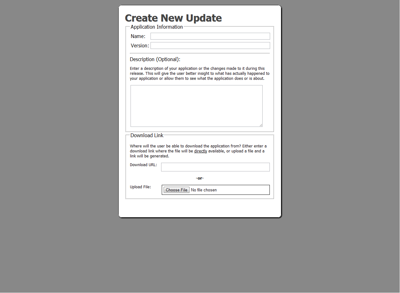
I created a form for my application and I am having trouble deciding where to place the submit button.

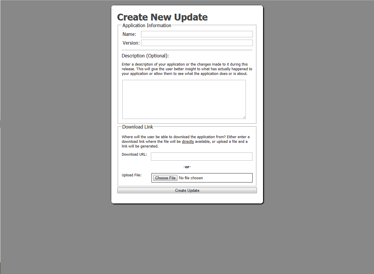
Here is a picture of the form with my current submit button:

Here is a picture of the form without the submit button:


What do you think? Where is the best place to put the submit button so that it is both usable, as well as not ugly. Also, if you have any tips or tricks, please post them as well. I don't mind. :)

Thanks for your help,
-Sunjay03
Dani AI

Generated

A short, practical summary for : put the primary action where people finish reading the form — after the last field, on its own action row, and styled clearly as the primary call-to-action. That general point echoes and , but the thread so far misses a few modern UX details (mobile layout, clear labelling, accessibility, and the risks of a plain Reset button).

Placement guidance that works reliably:

  • Single-column forms: action on its own row, right-aligned for left-to-right locales (or centered for very short forms).
  • Multi-column forms: place the action row beneath the columns and span it across the grid so it reads as the completion step.
  • Short or modal forms: a centered primary button is acceptable; for long forms consider a sticky/anchored primary action on mobile so users don’t have to scroll back up.

Important behavior and accessibility notes (gaps in earlier replies):

  • Use a descriptive label like Save changes or Update profile instead of generic Submit.
  • Avoid a Reset button unless there’s a clear, tested need; resets commonly cause accidental data loss — prefer an explicit “Clear” with confirmation or an undo/save-draft flow. (’s suggestion to offer a reset is fine technically, but risky in practice.)
  • Ensure keyboard accessibility, visible focus outlines, 44px+ tappable targets on mobile, and sufficient color contrast per WCAG.

Quick checklist and an example action-row style to apply immediately:

  • put primary action after last field
  • visually emphasize primary button, separate secondary/destructive actions
  • test on mobile and with keyboard/screen reader
.form-actions {
  display: flex;
  gap: 8px;
  justify-content: flex-end;
  margin-top: 1.25rem;
}
.btn-primary {
  background: #0b74de;
  color: #fff;
  border: 0;
  padding: .6rem 1rem;
  border-radius: 4px;
}
@media (max-width:600px){
  .form-actions { position: sticky; bottom: 0; padding: .5rem; background:#fff; }
  .btn-primary { width:100%; }
}

Recommended Answers

All 4 Replies

the place where u kept is good... :)

Submit buttons are always best displayed at the end of any form. This allows the people who fill it in know that they have completed the form and all they have to do now is send it off.

Something worth adding to any form is a reset button so if they would like to reset the form and start again without having to manually clearing each field.

<input type="reset" name="reset" id="reset" value="Clear" />

if you want the buttons next to each other simple place the codes like so.

<input type="submit" name="submit" id="submit" value="submit" /><input type="reset" name="reset" id="reset" value="Clear" />

a place where it could be seen easily as well not look distructive

The best place would be at the bottom of your form. It's naturally where people look and where a majority of other forms put that button. It's best practice to follow web standards on anything like this of you want to get a good success rate.

Be a part of the DaniWeb community

We're a friendly, industry-focused community of developers, IT pros, digital marketers, and technology enthusiasts meeting, networking, learning, and sharing knowledge.