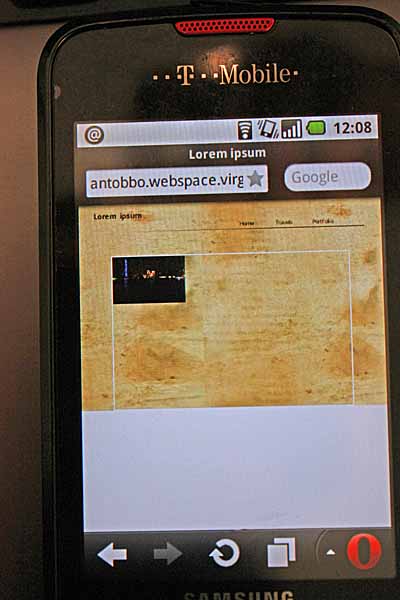
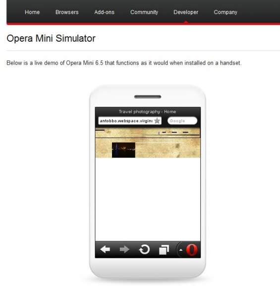
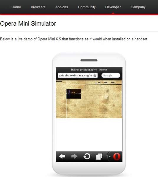
Hi there, I am doing a website for a client and I am trying to get it to run on the major browsers, so I am testing on the usual ones + IE6 and also on a few mobile browsers. On my android phone, the website looks fine on the native browsers but Opera mini is not displaying the content as it should, and it seems to be the only browsers that does this. I have attached a picture of how opera mni renders the home page, the picture is somewhat resized if you compare it with the link above.
Now, in my original css I didn't have either width or height specified for the picture

#main_picture img
	{
	
		position:absolute;
		z-index:1;
	
	}

so I added them in and tested, but no joy, so I inserted the dimensions in the html - just one picture to try - but still no joy

<div id = "main_picture">
			<img src = "images/homepage/home_0.jpg" alt = " " class = "active" style = "width:700px;height:450px">
			<img src = "images/homepage/home_1.jpg" alt = " ">
			<img src = "images/homepage/home_2.jpg" alt = " ">
		</div><!--END OF main_picture -->

I would really like to get this website right in opera mini but I am a bit at loss as to what to do because I am not sure what it is that is broken in my css/html.
Oh, almost forgot, even the script doesn't work in opera mini for whatever reason.
I have done a bit of reading here and there like this http://dev.opera.com/articles/view/opera-mini-web-content-authoring-guidelines, but nothing that helps me that much. I even had a look at some opera mini development forums, but to be honest I haven't found anything.
Does anybody have any suggestion at all?
thanks

Recommended Answers

All 26 Replies

Try linking it to a stylesheet with the following attribute,

media="handheld"

put this attribute in the <link> tag (ext. stylesheets)
Dunno much about this, doesn't work always; worked for me once or twice only, a little strange! Maybe something else was doing it/blocking it from doing it?


If it still doesn't work, try using the default HTML attributes for image resizing

Hope this helps! :)

Hi Violet_82,

Try something like this (make this the VERY LAST style in your head)

<style type="text/css">
@media only screen and (max-device-width: 480px){
#main_picture img {
width: 100%;
}
}
</style>
</head> NOTICE HOW THAT STYLE IS THE LAST THING?

Once you upload it, try to view it in the browser again. Let me know the results!

HI there, thanks for the suggestions.
@floatingDivs: I hope I did it correctly, here's how my head tag looks like now:

...
<head>
		<meta http-equiv="Content-type" content="text/html; charset=utf-8">
		<meta http-equiv="Content-Language" content="en">
		<meta name="description" content="Digital photography">

		<link rel = "stylesheet" type = "text/css" href = "css/styles.css">
		<link rel = "stylesheet" type = "text/css" href = "css/containers.css">

		<script type = "text/javascript" src="https://ajax.googleapis.com/ajax/libs/jquery/1.7.1/jquery.min.js"></script>
		<script type = "text/javascript">

			function changeImages(){

				var active_image = $("#main_picture .active");

				var next_image = ($("#main_picture .active").next().length > 0) ? $("#main_picture .active").next() : $("#main_picture img:first");

				next_image.css('z-index',2);

				active_image.fadeOut(1500,function(){

					active_image.css('z-index',1).show().removeClass('active');

					next_image.css('z-index',3).addClass('active');

				});

			}

$(document).ready(function(){

	setInterval('changeImages()',3000);
});


		</script>

		<title>Travel photography - Home</title>

		<style type="text/css">
				@media only screen and (max-device-width: 480px)
				{
				#main_picture img {width: 100%;}
				}
		</style>

	</head>
...

Also I have added the width and height to the css (I have also tried without) so that now I have

#main_picture img
	{
	
		position:absolute;
		z-index:1;
		width:700px;
		height:450px;
	
	}

But unfortunately it doesn't work. The picture is still resized, the script doesn't work and there is a big white space at the bottom, so unfortunately nothing has changed

@dantinkakkar Sorry I didn't quite get where to put that. Does media="handheld" need to go in one of the css I have already? like <link rel = "stylesheet" type = "text/css" media="handheld" href = "css/containers.css"> ?

If it still doesn't work, try using the default HTML attributes for image resizing

Do you mean adding width and height to the css?
cheers

What if you add this meta tag under your TITLE (<title>blah blah blah</title>) attribute.

<meta name="viewport" content="width=device-width, initial-scale=1, maximum-scale=1">

hi folatingDivs will try that in a second thanks, but before doing that do I need to keep this

...
<style type="text/css">
@media only screen and (max-device-width: 480px){
#main_picture img {
width: 100%;
}
}
</style>
...

and keep the dimensions in the css

#main_picture img
	{
	
		position:absolute;
		z-index:1;
		width:700px;
		height:450px;
	
	}

and add your code in addition to them?

Hi Violet,

Try this HTML page as your test for Opera mini. Replace the current one you have up and view it in your mobile browser(s).

<!DOCTYPE HTML PUBLIC "-//W3C//DTD HTML 4.01//EN" "http://www.w3.org/TR/html4/strict.dtd">
<html>
	<head>
		<meta http-equiv="Content-type" content="text/html; charset=utf-8">
		<meta http-equiv="Content-Language" content="en">
		<meta name="description" content="Digital photography">

		<link rel = "stylesheet" type = "text/css" href = "css/styles.css">
		<link rel = "stylesheet" type = "text/css" href = "css/containers.css">
<script type = "text/javascript" src="https://ajax.googleapis.com/ajax/libs/jquery/1.7.1/jquery.min.js"></script>

		<script type = "text/javascript">

			function changeImages(){

				var active_image = $("#main_picture .active");

				var next_image = ($("#main_picture .active").next().length > 0) ? $("#main_picture .active").next() : $("#main_picture img:first");

				next_image.css('z-index',2);

				active_image.fadeOut(1500,function(){

					active_image.css('z-index',1).show().removeClass('active');

					next_image.css('z-index',3).addClass('active');

				});

			}

$(document).ready(function(){

	setInterval('changeImages()',3000);
});


		</script>

		<title>Lorem ipsum</title>
    <meta name="viewport" content="width=device-width, initial-scale=1, maximum-scale=1">
<style type="text/css">
@media only screen and (max-device-width: 480px){
#main_picture img {
width: 100%;
}
}
</style>
	</head>

	<body>

		<div class = "wrapper">

			<div class = "heading_1">

				<h1>Lorem ipsum</h1>
			</div><!--END OF heading_1 -->

		<div class = "navigation">
			<ul>
				<li><a href = "#">Home</a></li>
				<li><a href = "#">Travels</a></li>
				<li><a href = "#">Portfolio</a></li>

			</ul>

		</div><!--END OF navigation-->
		<div class = "clear">
		</div><!--END OF clear -->

		<div class = "nav_bar">
			<img src = "images/bar.jpg" alt = "">
		</div><!--END OF nav_bar-->

		<div id = "main_picture">
			<img src = "images/homepage/home_0.jpg" alt = " " class = "active" style = "width:700px;height:450px">
			<img src = "images/homepage/home_1.jpg" alt = " ">
			<img src = "images/homepage/home_2.jpg" alt = " ">
		</div><!--END OF main_picture -->

		</div><!-- END OF wrapper -->

	</body>

</html>

Thanks a lot for that floatingDivs, but no joy I am afraid. Here's the link again just in case http://antobbo.webspace.virginmedia.com/petras/test/home.htm
I have tested it with the emulator and then on my phone just to be sure, and unfortunately it is always the same as before no difference.
Why would opera mini behave like that? I mean I understand the mobile issue to a point but the peculiar thing is that it is just opera mini, because, as I think I mentioned earlier on, the native browser - which I think is based on chrome - on my phone the page is perfect, even the script works!

While the image (and navigtion) are properly resized to fit the entire site in the screen, the #main_picture div is set a definite width (750px wide, 400px high or something like that...).

Try the code below and see if it fixes things.

<!DOCTYPE HTML PUBLIC "-//W3C//DTD HTML 4.01//EN" "http://www.w3.org/TR/html4/strict.dtd">
<html>
	<head>
		<meta http-equiv="Content-type" content="text/html; charset=utf-8">
		<meta http-equiv="Content-Language" content="en">
		<meta name="description" content="Digital photography">

		<link rel = "stylesheet" type = "text/css" href = "css/styles.css">
		<link rel = "stylesheet" type = "text/css" href = "css/containers.css">
<script type = "text/javascript" src="https://ajax.googleapis.com/ajax/libs/jquery/1.7.1/jquery.min.js"></script>

		<script type = "text/javascript">

			function changeImages(){

				var active_image = $("#main_picture .active");

				var next_image = ($("#main_picture .active").next().length > 0) ? $("#main_picture .active").next() : $("#main_picture img:first");

				next_image.css('z-index',2);

				active_image.fadeOut(1500,function(){

					active_image.css('z-index',1).show().removeClass('active');

					next_image.css('z-index',3).addClass('active');

				});

			}

$(document).ready(function(){

	setInterval('changeImages()',3000);
});


		</script>

		<title>Lorem ipsum</title>
    <meta name="viewport" content="width=device-width, initial-scale=1, maximum-scale=1">
<style type="text/css">
@media only screen and (max-device-width: 480px){
#main_picture {
height: auto;
width: 100%:
}
#main_picture img {
width: 100%;
}
}
</style>
	</head>

	<body>

		<div class = "wrapper">

			<div class = "heading_1">

				<h1>Lorem ipsum</h1>
			</div><!--END OF heading_1 -->

		<div class = "navigation">
			<ul>
				<li><a href = "#">Home</a></li>
				<li><a href = "#">Travels</a></li>
				<li><a href = "#">Portfolio</a></li>

			</ul>

		</div><!--END OF navigation-->
		<div class = "clear">
		</div><!--END OF clear -->

		<div class = "nav_bar">
			<img src = "images/bar.jpg" alt = "">
		</div><!--END OF nav_bar-->

		<div id = "main_picture">
			<img src = "images/homepage/home_0.jpg" alt = " " class = "active" style = "width:700px;height:450px">
			<img src = "images/homepage/home_1.jpg" alt = " ">
			<img src = "images/homepage/home_2.jpg" alt = " ">
		</div><!--END OF main_picture -->

		</div><!-- END OF wrapper -->

	</body>

</html>

By saying "default HTML attributes", I was referring to the height and width attributes of the <img> tag. They'll work hands down on mobile versions.

But wait, what's the predicament you're facing now?

Hi floatingDivs, thanks again for the suggestion. Your code has actually done something but the images are still the same size http://antobbo.webspace.virginmedia.com/petras/home.htm. The page now looks smaller, width-wise. I have attached 2 screenshots. The screenshot_last_code.jpg is the code with your last suggestion, the screenshot_last_code.jpg has your previous suggestion instead

@media only screen and (max-device-width: 480px){
#main_picture img { width: 100%; }}

This is the simulator I am using, in case you wonder http://www.opera.com/developer/tools/mini/ and I also test on my phone

@dantinkakkar, the predicament I am afraid it is always the same as you can see from the screenshots. The html at the moment has the width and height:

<div id = "main_picture">
			<img src = "images/homepage/home_0.jpg" alt = " " class = "active" style = "width:700px;height:450px">
			<img src = "images/homepage/home_1.jpg" alt = " " style = "width:700px;height:450px" >
			<img src = "images/homepage/home_2.jpg" alt = " " style = "width:700px;height:450px" >
		</div><!--END OF main_picture -->

thanks

@Violet82: I meant this:

<img src="image.jpg" width="200" height="150">

This was how we resized images seven to eight years ago. I think it's gonna work, but you gotta give it a try first.

Hi dantinkakkar, sorry I was a bit thick!
I gave it a go but nothing has changed, the picture is still resized.
I have run a test. I created a very simple page and I added an image and a div: div on the top and image at the bottom. They have the very same size 700px x 450px, really simple code to start with:

<!DOCTYPE HTML PUBLIC "-//W3C//DTD HTML 4.01//EN" "http://www.w3.org/TR/html4/strict.dtd">
<html>
	<head>
		<meta http-equiv="Content-type" content="text/html; charset=utf-8">
		<meta http-equiv="Content-Language" content="en">
		<meta name="description" content="Digital photography">
		<title>test</title>

	</head>

	<body>
		<div id = "main_picture" style ="width:700px; height:450px; border:3px solid BLACK; margin:0 auto;">
		</div>
		<p>
		<img src = "home_0.jpg" alt = " " class = "active">
		</p>
	</body>
</html>

you can view this code here: http://antobbo.webspace.virginmedia.com/petras/testina.htm.
Now let's view it in the opera mini emulator http://www.opera.com/developer/tools/mini/ and it still does it, the div keeps its size but the picture has been resized.
The reason why I run this test is because I wanted to make sure that there wasn't anything in my code that prevented your suggestions and floatingDivs to work. You never know, I might have written some dodgy code, but this seems to demonstrate that it is not the case.
So here are a few combinations I have tried:

1)

<!DOCTYPE HTML PUBLIC "-//W3C//DTD HTML 4.01//EN" "http://www.w3.org/TR/html4/strict.dtd">
<html>
	<head>
		<meta http-equiv="Content-type" content="text/html; charset=utf-8">
		<meta http-equiv="Content-Language" content="en">
		<meta name="description" content="Digital photography">
		<title>test</title>
		<style>
		@media only screen and (max-device-width: 480px){
		#main_picture img {
		width: 100%;
		}
		}
</style>
		

	</head>

	<body>
		<div id = "main_picture" style ="width:700px; height:450px; border:3px solid BLACK; margin:0 auto;">
		</div>
		<p>
		<img src = "home_0.jpg" alt = " " class = "active">
		</p>
	</body>
</html>

No joy, same situation, image resized, div keeps its size.
2)

<!DOCTYPE HTML PUBLIC "-//W3C//DTD HTML 4.01//EN" "http://www.w3.org/TR/html4/strict.dtd">
<html>
	<head>
		<meta http-equiv="Content-type" content="text/html; charset=utf-8">
		<meta http-equiv="Content-Language" content="en">
		<meta name="description" content="Digital photography">
		<title>test</title>
		<meta name="viewport" content="width=device-width, initial-scale=1, maximum-scale=1">
		<style>
		@media only screen and (max-device-width: 480px){
		#main_picture img {
		width: 100%;
		}
		}
</style>
		

	</head>

	<body>
		<div id = "main_picture" style ="width:700px; height:450px; border:3px solid BLACK; margin:0 auto;">
		</div>
		<p>
		<img src = "home_0.jpg" alt = " " class = "active">
		</p>
	</body>
</html>

Same here.
3)

<!DOCTYPE HTML PUBLIC "-//W3C//DTD HTML 4.01//EN" "http://www.w3.org/TR/html4/strict.dtd">
<html>
	<head>
		<meta http-equiv="Content-type" content="text/html; charset=utf-8">
		<meta http-equiv="Content-Language" content="en">
		<meta name="description" content="Digital photography">
		<title>test</title>
		<meta name="viewport" content="width=device-width, initial-scale=1, maximum-scale=1">
		<style>
		@media only screen and (max-device-width: 480px){
		#main_picture {
		height: auto;
		width: 100%:
		}
		#main_picture img {
		width: 100%;
		}
}
</style>
		

	</head>

	<body>
		<div id = "main_picture" style ="width:700px; height:450px; border:3px solid BLACK; margin:0 auto;">
		</div>
		<p>
		<img src = "home_0.jpg" alt = " " class = "active">
		</p>
	</body>
</html>

Same here.
4)

<!DOCTYPE HTML PUBLIC "-//W3C//DTD HTML 4.01//EN" "http://www.w3.org/TR/html4/strict.dtd">
<html>
	<head>
		<meta http-equiv="Content-type" content="text/html; charset=utf-8">
		<meta http-equiv="Content-Language" content="en">
		<meta name="description" content="Digital photography">
		<title>test</title>


	</head>

	<body>
		<div id = "main_picture" style ="width:700px; height:450px; border:3px solid BLACK; margin:0 auto;">
		</div>
		<p>
		<img src = "home_0.jpg" alt = " " class = "active" width="700" height = "450">
		</p>
	</body>
</html>

No joy.

5)

<!DOCTYPE HTML PUBLIC "-//W3C//DTD HTML 4.01//EN" "http://www.w3.org/TR/html4/strict.dtd">
<html>
	<head>
		<meta http-equiv="Content-type" content="text/html; charset=utf-8">
		<meta http-equiv="Content-Language" content="en">
		<meta name="description" content="Digital photography">
		<title>test</title>
<meta name="viewport" content="width=device-width">
		<style>
		@media handheld
		{
		            img { max-width: 100%; }

		}
		</style>


	</head>

	<body>
		<div id = "main_picture" style ="width:700px; height:450px; border:3px solid BLACK; margin:0 auto;">
		</div>
		<p>
		<img src = "home_0.jpg" alt = " " class = "active" >
		</p>
	</body>
</html>

No luck.
So, I think we can safely assume that somehow opera mini is resizing the picture no matter what we do. The thing ism can we actually prevent it from doing that? I am not very well versed in mobile issues, so I had a read at this http://dev.opera.com/articles/view/an-introduction-to-meta-viewport-and-viewport/ but still I am not sure what to do.
Has anybody come up with something by any chance?
thanks

Oh my GOD! How did I not freaking notice??? Change your Doctype to HTML5, meaning get rid of the very top line of your code

<!DOCTYPE HTML PUBLIC "-//W3C//DTD HTML 4.01//EN" "http://www.w3.org/TR/html4/strict.dtd">

and replace it with

<!DOCTYPE html>

Mobile browsers don't render well without the HTML5 doctype. I had to take a look at my University's mobile website (which I helped create) to realize that we were using HTML5 doctype to get properly sized content.

Try the HTML below.

<!DOCTYPE html>
<html>
	<head>
		<meta http-equiv="Content-type" content="text/html; charset=utf-8">
		<meta http-equiv="Content-Language" content="en">
		<meta name="description" content="Digital photography">
		<title>test</title>
		<meta name="viewport" content="width=device-width, initial-scale=1, maximum-scale=1">
		<style>
		@media only screen and (max-device-width: 480px){
		#main_picture {
		height: auto;
		width: 100%:
		}
		#main_picture img {
		width: 100%;
		}
}
</style>
		

	</head>

	<body>
		<div id = "main_picture" style ="width:700px; height:450px; border:3px solid BLACK; margin:0 auto;">
		</div>
		<p>
		<img src = "home_0.jpg" alt = " " class = "active">
		</p>
	</body>
</html>
commented: :P I failed to notice, too! :D :) +4

thanks a lot for that folatingDivs, unfortunately it didn't work though, the image is still resized. Ah I amended the code slightly, in the media rule it needs to be

img {
		width: 100%;
		}

because the image is not within the main div. I have also tried without variation anyway and it doesn't work I am afraid. Thanks for all the suggestions thought. It is very frustrating that the default behaviour of the browser cannot be changed

Hi Violet_82,

I spent about 15 minutes trying to set up an example for you.

Here's the link to the uploaded image: http://illinois.edu/1083/violet.html

Obviously, all you see is the image (and no border, etc) on the desktop. Viewing it in a mobile device, on the other hand, will show you everything you've styled. I used the Opera Mini link you've repeatedly posted.

So, the very first thing you need to realize is when developing for a mobile device, you shouldn't be using pixels but rather PERCENTAGES. With your code, the div containing the image has a width of (over) 1000px but the device you are viewing it on has much less. Thus, it's trying to render all 1000px on its 320px screen (guess) and it's resizing everything to fit the 1000px into the screen.

For media devices, you should be using 100% of the screen for most things (thus creating a single column, fluid layout (meaning a 320px screen views 320px (#main_picture) while a 480px screen views 480px, etc.)

Here's the code and take a look at my CSS for the mobile device.

<!DOCTYPE html PUBLIC "-//W3C//DTD XHTML 1.0 Strict//EN"
    "http://www.w3.org/TR/xhtml1/DTD/xhtml1-strict.dtd">

<html xmlns="http://www.w3.org/1999/xhtml">
<head>
  <meta http-equiv="Content-type" content="text/html; charset=us-ascii" />

  <title>test</title>
  <meta name="viewport" content="width=device-width, initial-scale=1, maximum-scale=1">
  <style type="text/css">
    @media all and (max-width: 480px) {
      #main_picture { background:red; width: 90%; height: auto; border: 2px solid red; margin: 0 auto; }
      img { width: 100%; }     
    }
  </style>
</head>

<body>
  <div id="main_picture">
    <img src="http://antobbo.webspace.virginmedia.com/petras/home_0.jpg" />
  </div>
</body>
</html>

floatingDivs, thank you very much for all your help, much appreciated. I had a look at your media rule, everything is clear. Do you know of any resource I can have a look to read more about it?

I will try to apply that to my website then. One question only. You used xhtml, if I use html4 strict, would that work as well?

Hi Violet_82,

By far the best resource I stumbled upon was HTML5Rocks "Mobifying your site".

http://www.html5rocks.com/en/mobile/mobifying/

I did not use xhtml, I used html5 which is a direct competitor IIRC. That's the biggest thing in making sure you're site comes out looking great on mobile screens. It's as simple as switching up your Doctype and running it through a validator to make sure it's 100% valid syntax/declarations.

The biggest thing will be going from

<img src="..." alt="..." />

to

<img src="..." alt="...">

since I think HTML5 doesn't require the slash to end the tag. Plus, you get access to some very cool things (rounded borders supported by most browsers, <nav> and <header> tags, etc.)

ah ok I see, it's because I saw the xhtml doctype. So to sum up, if I use html5 (whose doctype declaration is <!DOCTYPE html> ) it should work. What I seem to understand from all this thread (and thank you for that) is that essentially I can have a "normal" css for the desktop version and a mobile one using the @ rule.
I was also reading something about liquid layout today, so I wonder if that can help as well. I usually go for fixed width, but I suppose I can change the layout of the website in the @ rule from fixed width to liquid, that should work because the page should resize automatically to fit different screens I presume...

Yes. You can use fixed width for a desktop version and fluid width for a mobile version.

Also, you don't need to put all your mobile (liquid) CSS into a <style> tag.

You can do the following as well (to link to a CSS stylesheet for mobile browsers:

<link rel="stylesheet" media="only screen and (max-width: 640px)" href="/static/css/index_page_mobile.min.css" />

Brill, thanks a lot for all your help, I will now try to apply all this to my site, and fingers crossed I should be able to adapt it to the mobile site
thanks

ah sorry, 1 thing I think it deserves some attention, sorry I completely forgot.
I am doing some testing and apply your method to my pages, and I have noticed that it works fine only if there is no other css added to the page. So, take your example:

<!DOCTYPE html PUBLIC "-//W3C//DTD XHTML 1.0 Strict//EN"

    "http://www.w3.org/TR/xhtml1/DTD/xhtml1-strict.dtd">


<html xmlns="http://www.w3.org/1999/xhtml">

<head>

  <meta http-equiv="Content-type" content="text/html; charset=us-ascii" />


  <title>test</title>

  <meta name="viewport" content="width=device-width, initial-scale=1, maximum-scale=1">

  <style type="text/css">

    @media all and (max-width: 480px) {

      #main_picture { background:red; width: 90%; height: auto; border: 2px solid red; margin: 0 auto; }

      img { width: 100%; }     

    }

  </style>

</head>


<body>

  <div id="main_picture">

    <img src="http://antobbo.webspace.virginmedia.com/petras/home_0.jpg" />

  </div>

</body>

</html>

It works perfectly. But if say I add another css declaration in the code <link rel = "stylesheet" type = "text/css" href = "css/mobile.css"> , and I mean anywhere before or after the title tag, or before the viewport (I tried them all) everything stops working, in that opera resizes the picture which appears like the one in my original link. So it appears that adding something else in the head tags causes this behaviour in opera. Have you ever noticed that? Even if you add an inline style, that throws off the image, and everything resizes

Are you adding that other stylesheet AFTER the mobile CSS? If so, that's your cause. CSS is order-based, meaning if you first apply the mobile CSS and THEN your regular CSS (and both style the same divs), obviously the desktop CSS will override the mobile CSS.

Basically, your mobile CSS should be the LAST thing in your </head> since it OVERRIDES desktop CSS (if the criteria -- in this case a max-width of 480px -- is met).

Let me know if that doesn't make sense.

It makes perfect sense floatingDiv, in fact the mobile css is the last one. The mobile css in general seems to behave oddly thought, whatever the order.
Let me explain. I mentioned earlier on that I am doing some tests: basically I am rewriting the whole home.htm page and adding one by one all the html elements and the styles in the css, just to see where the mistakes are, to see where the css is preventing opera mini to display the website correctly. Every change I make, I upload the css to the server and test in opera mini. It really is time consuming, to the point that I am thinking to myself "whatever, I don't care if opera mini doesn't diplay my site as it should".
Anyway, I got to this point http://antobbo.webspace.virginmedia.com/petras/mobile/testina.htm when the site looks a bit odd in the desktop version and quite well in opera mini. So I am trying to fix my desktop and when I style a bit more the #main_picture container in my normal css (containers.css) the layout of the site in opera mini breaks and everything gets resized. The thing is I haven't touched the mobile css, I have only added some code to the normal one, but somehow this is effecting the mobile css as well.
My head tag look like this:

<head>
		<meta http-equiv="Content-type" content="text/html; charset=utf-8">
		<meta name="description" content="Digital photography">

		<title>Travel photography - Home</title>
		<link rel = "stylesheet" type = "text/css" href="css/containers.css">
		<meta name="viewport" content="width=device-width, initial-scale=1, maximum-scale=1 user-scalable=yes">
		 <link rel = "stylesheet" type = "text/css" media=" only screen and (max-device-width: 640px)" href="css/mobile.css">

	</head>

So this is what's really frustrating me and the order of the css in the head tag seems to count only to an extent.
Ah, I forgot, you will notice that I have used html 4.01 strict in my doctype, I have tested it with html 5 doctype but the result is the same

Hi Violet_82,

So I took a look at the mobile version of site (it looks horrific) and the desktop version (looks good except for the lack of clearing at the bottom [the image goes past the "wrapper"]).


I'll be blunt because I feel you are going down the wrong path.

First off, your navigation looks really bad on the mobile browser. Here's why: you are floating your list on the desktop version so it's naturally pulling in the float style from the containers.css file even when you are in a mobile device.

What you need to do is turn off the floats in a mobile device (you shouldn't float things in mobile devices; not all of them support floating and it looks terrible in smaller viewports).

Here's how you do that:

Take a look at your containers.css file and find out where you've put floats. Go into your mobile.css file and (select the same class [i.e. #container <-- example]) override it.

Floated element in containers.css

#container { float: left; }

Disable floating of element in mobile.css

#container { float: none; }

Do it for all your floated elements.


Secondly, override your absolute positioning in the mobile stylesheet. Do it the same way as the above mentioned override.

Absolutely positioned element in containers.css

#main_picture img { position: absolute; }

Relatively positioned element in mobile.css

#main_picture img { position: relative; }

From what I'm seeing in the mobile view, the image has been shifted to the left of the screen (outside the "container"). That's typically a sign of an absolutely positioned element.

Basically, there should be ZERO floating and absolute positioning in a mobile view of a website. Navigation should be displayed with one item per row. The site should be one columned (yours already is).

Here's a family friend's website: http://www.prelumpress.com/

If you view it in a desktop browser, you'll notice the site is multi-columned. However, if you resize your monitor to a small enough size (around 800px), you'll notice it dramatically shift into a single-columned view.

Hi floatingDivs,
thanks again for that. Don't worry I understand your bluntness. Unfortunately I am not an expert in mobile css so I had no idea I had to remove the floats and the absolute positioning. I also didn't know that a different css can pull style from another one, ie the mobile's from the desktop's. I thought they were separate and each of them worked with the desktop and with a mobile device respectively.
I will give it a go as soon as I have a second and I will apply this to the main website without going through another test site. I might post again in this thread so I leave it open for a little while still.
I much appreciated all your help and the time you've spent on addressing my issues, I hope I haven't wasted any of your time.

floatingDiv, but if I want to move a div that has a relative position how do I do it? In a desktop browser I would use top, left, bottom and right but in a mobile screen, how do I bring a div up or down? I have a few positioned relative divs in here http://antobbo.webspace.virginmedia.com/petras/test/egypt.htm and in the mobile screen the main one - which contain the picture is locked at the bottom for some reason and there is no way I can move it from there, no matter what property I use and what margins I use. Also things like overlays don't seem to work on the mobile site. I had a look around but there seems to be nothing around about it.
I mean I appreciate what you said about floating and position absolute for mobile phones but these have no floating and no position absolute:

.overlay
	{

		display:none;
		background-color:black;
		position:fixed;
		opacity:0.75;
		filter:alpha(opacity=75); /* For IE8 and earlier */
		top:0;
		bottom:0;
		right:0;
		left:0;
		width:100%;
		z-index:100;

	} 
	
.full_images
	{
	
		display:none;
		background-color:black;
		position:fixed;
		width:700px;
		height:490px;	
		z-index:102;
		left:50%;
		top:50%;
		margin:-245px 0 0 -350px; 
	
	}
	
.image_div
	{
	
		border:1px solid transparent;
		width:660px;
		height:450px;
		margin:20px auto 0;
		z-index:103;
		/*no positioning so that I can centre the image*/
	}
	
.close_button
	{
		
		position:absolute;
		top:0;
		right:0;
		z-index = 104;
	
	}
Be a part of the DaniWeb community

We're a friendly, industry-focused community of developers, IT pros, digital marketers, and technology enthusiasts meeting, networking, learning, and sharing knowledge.