<input type="text" placeholder="Enter Username" />

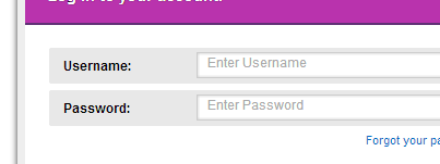
as you can see in file. i have a filed and in that field i have a placeholder "Enter username". but placeholder is bit high. i want to lower it. i am not sure best way to go about this. iam think using css tags
Dani AI

Generated

Building on 's example and 's suggestion about line-height (and 's note about font differences), here are some practical, browser-safe ways to get placeholder text sitting where you want it without relying on eyeballing pixel values.

Make the input a predictable box: give it an explicit height and use box-sizing: border-box so any vertical padding is counted inside that height. That avoids surprises when you add padding for left/right spacing. If you want single-line, visually centered text, keep vertical padding minimal and make the content area stable across browsers and platforms. See details on box sizing here: box-sizing on MDN.

Target the placeholder itself when you need different size, color, or tweaks that affect how it sits relative to typed text. Use the standard ::placeholder plus vendor-prefixed rules so older browsers follow the same look. Example selectors you can use:

::-webkit-input-placeholder { /* Chrome, Safari, Opera */ }
:-ms-input-placeholder { /* IE 10+ */ }
::-moz-placeholder { /* Firefox 19+ */ }
::placeholder { /* standard */ }

More on the placeholder pseudo-element: ::placeholder on MDN.

If alignment still looks off on a particular device, check for browser-native control styles (-webkit-appearance), test with the exact font that will be used on the platform, and remember that different fonts have different ascender/descender metrics. For pixel-perfect control across all devices, replace the native placeholder with an absolutely positioned label (the “floating/overlay label” pattern) — it gives full control over position and animation.

Recommended Answers

All 5 Replies

use a line height on the input...

input {
    line-height: ##;
}

does it make it differce if i use padding-top? do you know what is the diffence between line-height and padding-top

Line height is when you adjust the spacing of the text... as an example, have you ever had an english teacher that would make you force you to follow the MLA rules and make you double line spacing? That is an example of what line spacing looks like.

Padding on the other hand is would push everything in the div down, left, right, top (wherever it is set to)...

You should look more into line height and Paddings... you will get used to them later on!

It would make a difference later on if you use padding top and line height if your manipulating more lines of text :)

Visit some websites to learn more about them or use this site :)

Hope this helps!

Feel free to ask more questions!

In this particular example, if you set a line-height to something just under the height of the input field, then you can play around with any font face, font style, font size, etc. and it will vertically center the text.

If you use padding, instead, then you'll have to use your eye to figure out the best number of pixels to push the text down, and it might not look perfect for people in other operating systems that might not have the font installed (Arial for Windows vs Helvetica for Mac, for example).

It's a good idea for the input field to have 1 or 2 pixels of padding because it doesn't just control vertical spacing but horizontal spacing as well, and you don't want the text to rub right up against the edge of the textbox. (Most web browsers give input fields a few pixels of padding by default, but it's good practice to overwrite this for consistency among browsers.)

Or use Dani's solution :)

Be a part of the DaniWeb community

We're a friendly, industry-focused community of developers, IT pros, digital marketers, and technology enthusiasts meeting, networking, learning, and sharing knowledge.