
Hello all, I wonder if you can help me with this. I wanted to create a page which, among the other things, has a div with a lot of text inside. Below this div there will be 2 buttons. When viewed on a mobile, the height of this div become fixed to fit the screen and the content inside becomes scrollable so that the two buttons below the div are always visible. That's all done with media queries and it works absolutely fine except for the fact that users will never know that the content in the div is scrollable because - I have just realized - mobile devices won't show scrollbars by default and in fact not even during the scrolling. I have done a bit of googling and nobody seems to suggest any pure CSS/HTML solution, maybe because there isn't. Is anybody aware of any CSS/HTML fix? If not what would be a good reliable and fairly easy to integrate plug-in that will achieve that?
Here is a screenshot from android, as you can see no scrollbars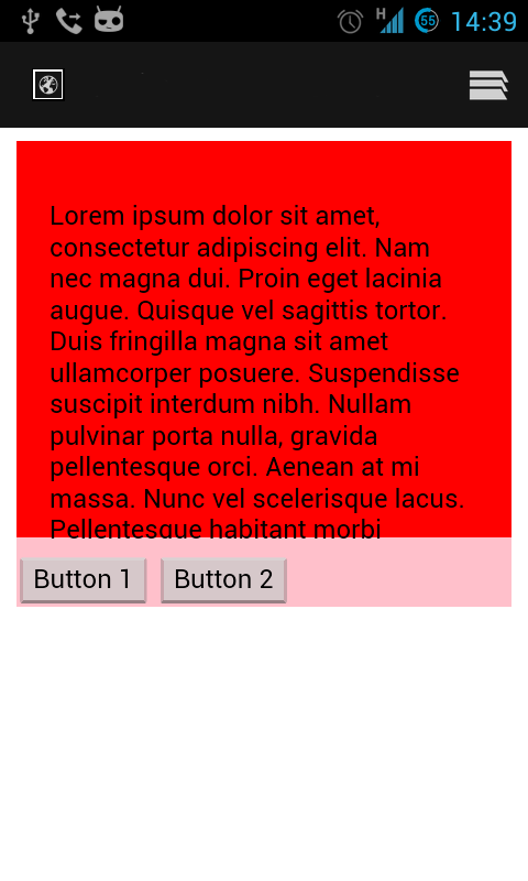
Code-wise, it is a simple html page
 <html>
<head>
<meta name="viewport" content="width=device-width, initial-scale=1.0">
<title>Test</title>
<link rel="stylesheet" type="text/css" href="styles.css">
</head>
<body>
<div class="contentWrapper">
<div class="contentConstrained">
<div class="content">
<p>
Lorem ipsum dolor sit amet, consectetur adipiscing elit. Nam nec magna dui. Proin eget lacinia augue. Quisque vel sagittis tortor. Duis fringilla magna sit amet ullamcorper posuere. Suspendisse suscipit interdum nibh. Nullam pulvinar porta nulla, gravida pellentesque orci. Aenean at mi massa. Nunc vel scelerisque lacus. Pellentesque habitant morbi tristique senectus et netus et malesuada fames ac turpis egestas. Phasellus purus felis, porttitor ac elementum nec, tristique et odio. Fusce vel justo justo. Cras eu pretium arcu. Phasellus vel felis neque.</p>

<p>Praesent vehicula purus ullamcorper odio semper, aliquam pellentesque ipsum consectetur. Sed hendrerit laoreet urna, nec aliquet ante sollicitudin commodo. Nullam feugiat sapien vel cursus elementum. Pellentesque tincidunt purus vitae elementum vulputate. Pellentesque a venenatis velit, egestas vestibulum nibh. Aliquam quis lorem dignissim, ultrices mauris id, ultrices arcu. Aenean mattis justo nisl.

Cras condimentum egestas turpis non porttitor. Quisque et pulvinar purus. Nam ultrices laoreet erat ac tincidunt. Nullam blandit accumsan elit ut mattis. Nulla sem augue, tincidunt non aliquam quis, cursus at odio. Sed vulputate libero nulla, vel ultricies enim tristique tempor. Morbi commodo metus blandit augue condimentum, eget aliquam mi aliquam. Donec quis libero non velit vulputate cursus sed ac purus. Fusce justo sapien, scelerisque sit amet faucibus sit amet, rhoncus id velit. Aenean in semper turpis. Donec iaculis erat erat, vitae pulvinar dui placerat a. Etiam ullamcorper gravida mi, sed auctor urna tincidunt nec.</p>

<p>Donec rutrum odio vitae odio cursus, id blandit est molestie. Duis aliquet ligula vel odio pulvinar pharetra. Proin suscipit tortor a urna adipiscing pharetra. Aliquam in tempus tellus. Cras tempor tellus purus. Fusce adipiscing congue tortor, vitae ullamcorper arcu eleifend ut. Vestibulum luctus quam sit amet convallis scelerisque. Sed ultrices leo tortor, at lacinia lorem suscipit quis. Lorem ipsum dolor sit amet, consectetur adipiscing elit. Vestibulum id est orci. Aliquam justo nunc, ultrices a tortor quis, fermentum cursus mi. Maecenas et risus vel velit tincidunt condimentum. Aliquam elementum elit purus, eget dictum arcu feugiat at. Nam tempor sollicitudin nulla rutrum interdum.
</p>
<p>
Lorem ipsum dolor sit amet, consectetur adipiscing elit. Nam nec magna dui. Proin eget lacinia augue. Quisque vel sagittis tortor. Duis fringilla magna sit amet ullamcorper posuere. Suspendisse suscipit interdum nibh. Nullam pulvinar porta nulla, gravida pellentesque orci. Aenean at mi massa. Nunc vel scelerisque lacus. Pellentesque habitant morbi tristique senectus et netus et malesuada fames ac turpis egestas. Phasellus purus felis, porttitor ac elementum nec, tristique et odio. Fusce vel justo justo. Cras eu pretium arcu. Phasellus vel felis neque.

Praesent vehicula purus ullamcorper odio semper, aliquam pellentesque ipsum consectetur. Sed hendrerit laoreet urna, nec aliquet ante sollicitudin commodo. Nullam feugiat sapien vel cursus elementum. Pellentesque tincidunt purus vitae elementum vulputate. Pellentesque a venenatis velit, egestas vestibulum nibh. Aliquam quis lorem dignissim, ultrices mauris id, ultrices arcu. Aenean mattis justo nisl.

Cras condimentum egestas turpis non porttitor. Quisque et pulvinar purus. Nam ultrices laoreet erat ac tincidunt. Nullam blandit accumsan elit ut mattis. Nulla sem augue, tincidunt non aliquam quis, cursus at odio. Sed vulputate libero nulla, vel ultricies enim tristique tempor. Morbi commodo metus blandit augue condimentum, eget aliquam mi aliquam. Donec quis libero non velit vulputate cursus sed ac purus. Fusce justo sapien, scelerisque sit amet faucibus sit amet, rhoncus id velit. Aenean in semper turpis. Donec iaculis erat erat, vitae pulvinar dui placerat a. Etiam ullamcorper gravida mi, sed auctor urna tincidunt nec.

Donec rutrum odio vitae odio cursus, id blandit est molestie. Duis aliquet ligula vel odio pulvinar pharetra. Proin suscipit tortor a urna adipiscing pharetra. Aliquam in tempus tellus. Cras tempor tellus purus. Fusce adipiscing congue tortor, vitae ullamcorper arcu eleifend ut. Vestibulum luctus quam sit amet convallis scelerisque. Sed ultrices leo tortor, at lacinia lorem suscipit quis. Lorem ipsum dolor sit amet, consectetur adipiscing elit. Vestibulum id est orci. Aliquam justo nunc, ultrices a tortor quis, fermentum cursus mi. Maecenas et risus vel velit tincidunt condimentum. Aliquam elementum elit purus, eget dictum arcu feugiat at. Nam tempor sollicitudin nulla rutrum interdum.
</p>
</div>
<div class="buttonsContainer">
<button>Button 1</button>
<button>Button 2</button>
</div>
</div>
</div>
</body>

</html>
And css here:
.contentWrapper{
    width:100%;

    background-color:pink;
}
.contentWrapper .contentConstrained{
    width:900px;
    margin:0 auto;
}

.contentWrapper .content{
    background-color:red;
    padding:20px;

}
.buttonsContainer{
    margin-top:10px;
}
@media (max-width: 767px) {
    .content{
        height:200px;
        width:260px;
        overflow:auto;
        /* overflow-y:auto; */
        margin:0 auto;
    }
    .contentWrapper .contentConstrained, .contentWrapper , .buttonsContainer{
        width:300px;
    }
    .contentWrapper {
        margin:0 auto;
    }
}

