Introduction
Regardless of whether you like notches on your devices or not, they exist, so as developers, we will have to adapt our Apps to work with them. In this tutorial, we will learn how to adapt our code to work with notches.
The device used in this example is the Pixel 3 XL because Android Studio already provides an AVD skin for this device.
Goals
At the end of the tutorial, you would have learned:
- How to adapt your App to work with display cutouts.
Tools Required
- Android Studio. The version used in this tutorial is Arctic Fox 2020.3.1 Patch 4.
Prerequisite Knowledge
- Basic Android.
Project Setup
To follow along with the tutorial, perform the steps below:
-
Create a new Android project with the default Empty Activity.
-
In Android Studio, open the AVD Manager by going to Tools > AVD Manager.
-
Select Create Virtual Device from the bottom left.
-
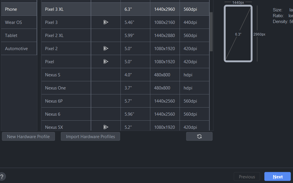
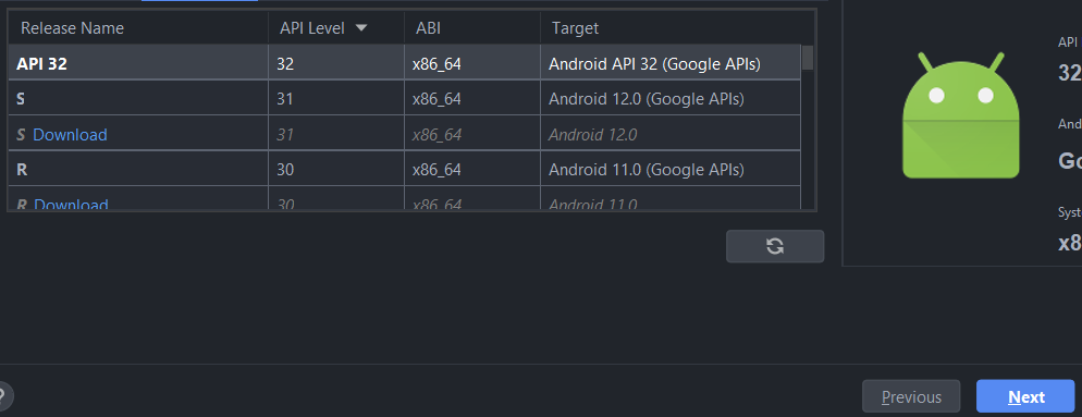
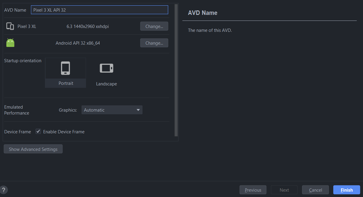
In the Phone Category, select the Pixel 3 XL, then hit Next.
-
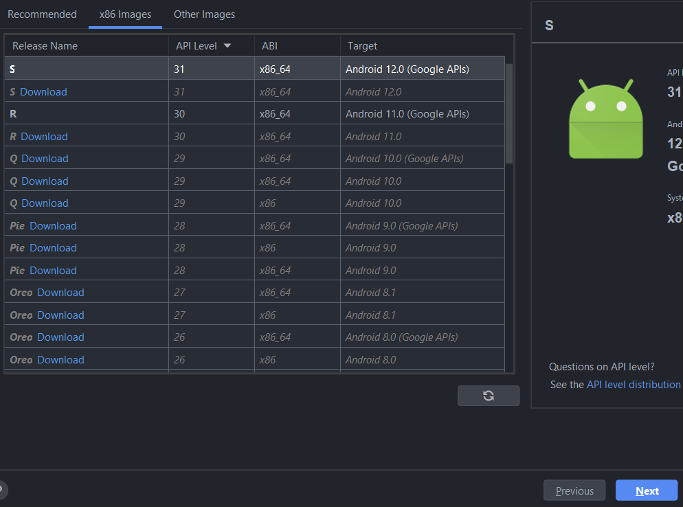
Select the Android S Image with API Level 32 (x86 or ARM depends on your PC), and hit Next.
-
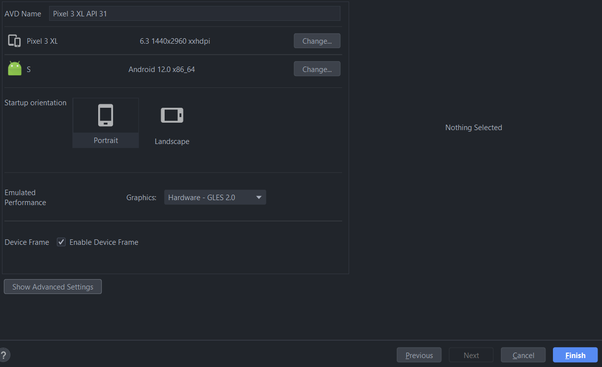
On the last screen, verify that Enable Device Frame is checked, and then hit Finish.
-
Create another AVD with the exact same configuration, but without the Device Frame.
-
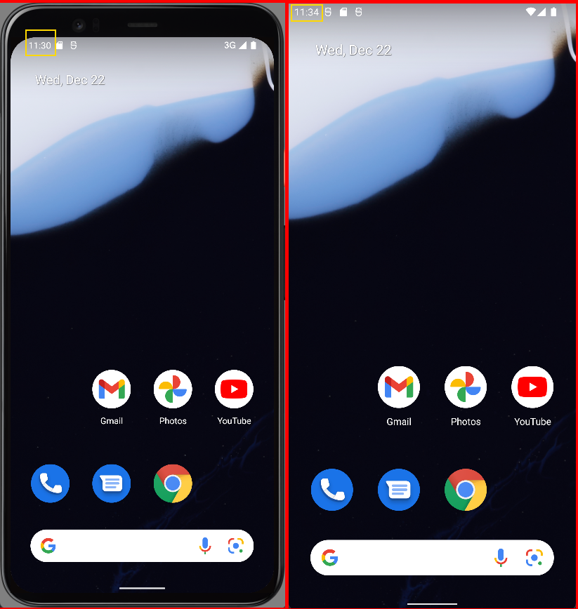
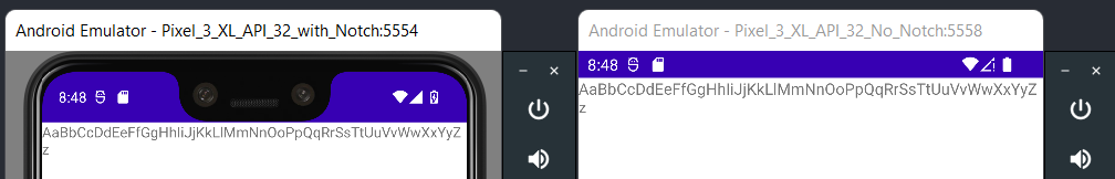
I was unable to find any documentation about whether the emulator is aware of the display cutout, but based on testing, the emulator is, in fact, aware of cutout areas from emulator skins, without requiring the developer to turn on Display cutout emulation in Developer settings. In the picture below, you can clearly see how the notification bar renders its content in a way that does not obstruct the emulator skin.
-
In themes.xml, replace the current theme of
parent="Theme.MaterialComponents.DayNight.DarkActionBar"with
parent="Theme.MaterialComponents.DayNight.NoActionBar" -
In strings.xml, add the text element below. The string is A-z to make it easy to check the overlay behavior later.
<string name="super_long_text">AaBbCcDdEeFfGgHhIiJjKkLlMmNnOoPpQqRrSsTtUuVvWwXxYyZz</string> -
Replace your activity_main.xml with the xml content below. The modified layout removes the bottom constraint of the TextView as well as setting its text value to the string resource declared in the previous step.
<?xml version="1.0" encoding="utf-8"?> <androidx.constraintlayout.widget.ConstraintLayout xmlns:android="http://schemas.android.com/apk/res/android" xmlns:app="http://schemas.android.com/apk/res-auto" xmlns:tools="http://schemas.android.com/tools" android:layout_width="match_parent" android:layout_height="match_parent" tools:context=".MainActivity"> <TextView android:layout_width="wrap_content" android:layout_height="wrap_content" android:text="@string/super_long_text" app:layout_constraintLeft_toLeftOf="parent" app:layout_constraintRight_toRightOf="parent" app:layout_constraintTop_toTopOf="parent" /> </androidx.constraintlayout.widget.ConstraintLayout> -
Add the below style element into your main themes.xml file (outside of the current
<style>, but still inside<resources>pairs). Make sure to modify theparentattribute because your base theme will have a different name compared to mine.<style name="AppTheme" parent="Theme.DaniwebCutoutArea" /> -
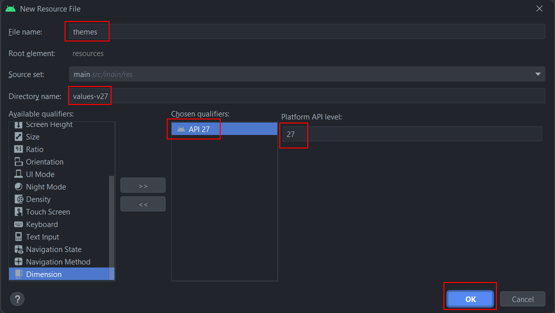
Create a new resource file for Android API 27 (I will explain why later). Right-click on themes > New > Values Resource File. Add the qualifier and name the file
themes.
-
Paste the content below into the new resource file (themes.xml (v27)) to override your base theme. Modify the
parentattribute if necessary.<resources xmlns:tools="http://schemas.android.com/tools"> <!-- Base application theme. --> <style name="AppTheme" parent="Theme.DaniwebCutoutArea"> <!-- Customize your theme here. --> </style> </resources> -
In AndroidManifest.xml, replace the current
android:themeattribute with the attribute below.android:theme="@style/AppTheme" -
Launch the app on both devices simultaneously by going to Run > Select Device >Select Multiple Devices > Check your two devices > OK > click the Play button to run the app on both AVDs.
You should now see something similar to the screenshot with the app running on both AVDs side-by-side.
Fullscreen Display
Display cutouts tend to present more problems to fullscreen Apps than non-fullscreen Apps. When your app needs to utilize the entire screen, by default, devices with a notch will refuse to allow your App to render inside the cutout area.
To understand this, first, let us attempt to make our App display in full screen. At the minimum, on Systems without a notch, you must do at least one thing for your app to display in fullscreen:
- Hide the System bars.
To do this, add the lines of code below into the onCreate() callback in MainActivity.kt, after the setContentView() call.
//Hide the system bars
val windowInsetsController: WindowInsetsControllerCompat? = ViewCompat.getWindowInsetsController(window.decorView) //gets WindowInsetsController
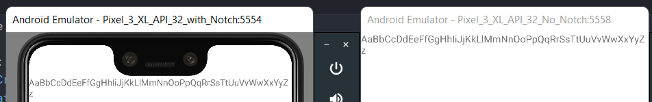
windowInsetsController?.hide(WindowInsetsCompat.Type.systemBars()) //Hides system bars (notification bar + navigation bar)Now let’s run our app on both emulators. When we put them side by side, the device with the notch would not completely go fullscreen, while the device without the notch displays in full screen perfectly.
Fullscreen with Notch
For systems with a notch, there are two more things that we must do to display our App in full screen.
-
Set the top-level Window object to display behind the System bars (notification and navigation bars). At the end of the
onCreate()callback, add the code below.//Enables Edge 2 Edge, allowing the app window to extend behind the system bars WindowCompat.setDecorFitsSystemWindows(window, false) -
Add an
<item>with the name android:windowLayoutInDisplayCutoutMode to the extendedApp Theme(themes.xml (v27)). This property was introduced on Android 8.1 to support display cutout in XML. Add the<item>below inside<style>in the themes.xml (v27) file to set the mode toshortEdges.<item name="android:windowLayoutInDisplayCutoutMode"> <!-- default--> shortEdges <!-- never--> <!-- always--> </item>
Optionally, you can also modify layoutInDisplayCutoutMode programmatically by setting a new value to window.attributes.layoutInDisplayCutoutMode.
If we run the App now, we can see that the text now takes advantage of the entire screen space.
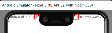
We also know that the text displays behind the notch by looking at the cutoff character h and the resuming character S. The characters behind the notch are IiJjKkLlMmNnOoPpQqRr. This is similar to the Youtube app (need to emulate pinch-to-zoom gesture first).
Solution Code
MainActivity.kt
package com.example.daniwebcutoutarea
import androidx.appcompat.app.AppCompatActivity
import android.os.Bundle
import androidx.core.view.ViewCompat
import androidx.core.view.WindowCompat
import androidx.core.view.WindowInsetsCompat
import androidx.core.view.WindowInsetsControllerCompat
class MainActivity : AppCompatActivity() {
override fun onCreate(savedInstanceState: Bundle?) {
super.onCreate(savedInstanceState)
setContentView(R.layout.activity_main)
//Hide the system bars
val windowInsetsController: WindowInsetsControllerCompat? = ViewCompat.getWindowInsetsController(window.decorView) //gets WindowInsetsController
windowInsetsController?.hide(WindowInsetsCompat.Type.systemBars()) //Hides system bars (notification bar + navigation bar)
 //Enables Edge 2 Edge, allowing the app window to extend behind the system bars
 WindowCompat.setDecorFitsSystemWindows(window, false)
}
}activity_main.xml
<?xml version="1.0" encoding="utf-8"?>
<androidx.constraintlayout.widget.ConstraintLayout xmlns:android="http://schemas.android.com/apk/res/android"
xmlns:app="http://schemas.android.com/apk/res-auto"
xmlns:tools="http://schemas.android.com/tools"
android:layout_width="match_parent"
android:layout_height="match_parent"
tools:context=".MainActivity">
<TextView
android:layout_width="wrap_content"
android:layout_height="wrap_content"
android:text="@string/super_long_text"
app:layout_constraintLeft_toLeftOf="parent"
app:layout_constraintRight_toRightOf="parent"
app:layout_constraintTop_toTopOf="parent" />
</androidx.constraintlayout.widget.ConstraintLayout>strings.xml
<resources>
<string name="app_name">Daniweb Cutout Area</string>
<string name="super_long_text">AaBbCcDdEeFfGgHhIiJjKkLlMmNnOoPpQqRrSsTtUuVvWwXxYyZz</string>
</resources>themes.xml
<resources xmlns:tools="http://schemas.android.com/tools">
<!-- Base application theme. -->
<style name="Theme.DaniwebCutoutArea" parent="Theme.MaterialComponents.DayNight.NoActionBar">
<!-- Primary brand color. -->
<item name="colorPrimary">@color/purple_500</item>
<item name="colorPrimaryVariant">@color/purple_700</item>
<item name="colorOnPrimary">@color/white</item>
<!-- Secondary brand color. -->
<item name="colorSecondary">@color/teal_200</item>
<item name="colorSecondaryVariant">@color/teal_700</item>
<item name="colorOnSecondary">@color/black</item>
<!-- Status bar color. -->
<item name="android:statusBarColor" tools:targetApi="l">?attr/colorPrimaryVariant</item>
<!-- Customize your theme here. -->
</style>
<style name="AppTheme" parent="Theme.DaniwebCutoutArea"/>
</resources>themes.xml (v27)
<resources xmlns:tools="http://schemas.android.com/tools">
<!-- Base application theme. -->
<style name="AppTheme" parent="Theme.DaniwebCutoutArea">
<!-- Customize your theme here.-->
        <item name="android:windowLayoutInDisplayCutoutMode">
 <!--            default-->
            shortEdges
 <!--            never-->
 <!--            always-->
        </item>
</style>
</resources>Summary
We have learned how to implement support for devices with display cutouts. Even though we only covers the short edge mode in this tutorial, the concept applies similarly to other display modes.
- Default: Only renders into the cutout area in landscape mode.
- Always: Always extend into the cutout area on both short and long edges. I have not seen any device with a camera cutout on the long edge. The only examples that I can think of are those curved Galaxy Edge devices.
- Never: Never extend into the cutout area.
- Short edge: Always extend into the cutout area on short edges only.
The full project code can be found here.