Introduction
Rather than modifying the button widget’s appearance in code, it is possible to do this in an XML resource instead. In this tutorial, we will learn how to create two different types of specialized XML resource files for changing the Drawable and the color.
Goals
At the end of the tutorial, you would have learned:
- How to use a Color State List resource.
- How to use a Drawable State List resource.
Tools Required
- Android Studio. The version used in this tutorial is Android Studio Chipmunk 2021.2.1.
Prerequisite Knowledge
- Basic Android.
Project Setup
To follow along with the tutorial, perform the steps below:
-
Create a new Android project with the default Empty Activity.
-
Add the vector resource below as ic_baseline_arrow_24.xml into drawable.
<vector android:height="24dp" android:tint="#000000" android:viewportHeight="24" android:viewportWidth="24" android:width="24dp" xmlns:android="http://schemas.android.com/apk/res/android"> <path android:fillColor="@android:color/white" android:pathData="M8,5v14l11,-7z"/> </vector> -
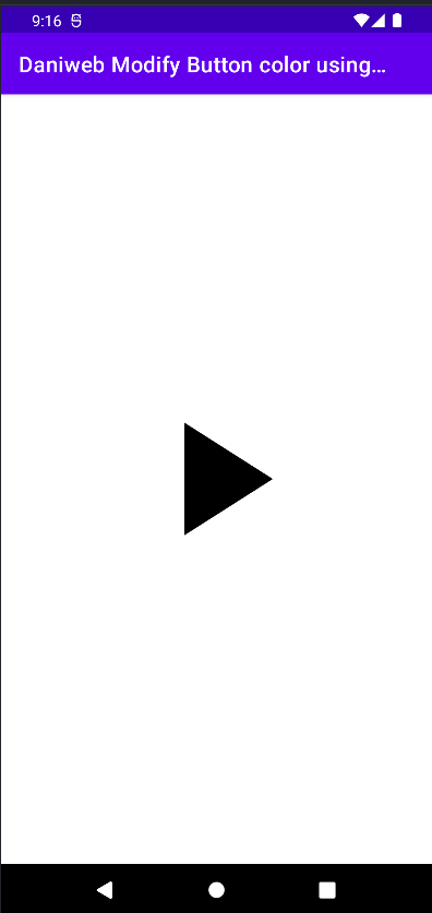
Replace the code inside of activity_main.xml with the code below. The screen will now contain a single ImageButton for us to play with.
<?xml version="1.0" encoding="utf-8"?> <androidx.constraintlayout.widget.ConstraintLayout xmlns:android="http://schemas.android.com/apk/res/android" xmlns:app="http://schemas.android.com/apk/res-auto" xmlns:tools="http://schemas.android.com/tools" android:layout_width="match_parent" android:layout_height="match_parent" tools:context=".MainActivity"> <ImageButton android:id="@+id/imageButton" android:layout_width="200dp" android:layout_height="200dp" android:backgroundTint="#00FFFFFF" android:scaleType="fitCenter" app:layout_constraintBottom_toBottomOf="parent" app:layout_constraintEnd_toEndOf="parent" app:layout_constraintStart_toStartOf="parent" app:layout_constraintTop_toTopOf="parent" app:srcCompat="@drawable/ic_baseline_play_arrow_24" /> </androidx.constraintlayout.widget.ConstraintLayout> -
If we run the app now, it should look like the screenshot below.
Creating a Color State List Resource
Conceptually, a state list resource is an XML file that tells Android what to do when a widget is in a certain state. For Button-type widgets, the common states are focused, pressed, and none.
Let us create the XML file first and dissect the syntax later.
-
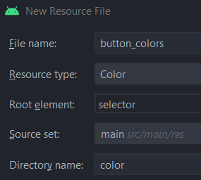
Right-click on res -> New -> Android Resource File.
-
Select the *Resource type as Color. The root element must be selector. Finally use color as the Directory name**.
-
Copy and paste the code below into the button_colors.xml file.
<?xml version="1.0" encoding="utf-8"?> <selector xmlns:android="http://schemas.android.com/apk/res/android"> <item android:color="@color/purple_700" android:state_pressed="true"/> <item android:color="@color/purple_700" android:state_focused="true" /> <item android:color="@color/black" /> </selector> -
Now that we have a resource file, it is time to discuss the syntax. There are only a couple of simple rules.
a. The root element of a state list resource file must be<selector>.
b. Every child item is an<item>.
c. Every<item>must have anandroid:colorattribute.
d. Theandroid:state_Xattributes define whether you want this color to be active when the button is in a specific state. e. Here, we configure for purple_700 to be active when the button is either in the focused or pressed states. When it is not focused or pressed, it takes on the color black.
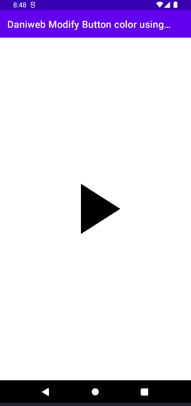
To apply these color states to our Play button, we can add an app:tint attribute directly to the ImageButton widget in the activity_main.xml. The value for this attribute is the path to the color state list button_colors.xml.
app:tint="@color/button_colors"If we run the app and test the button, it should change its color on click.
Modify Button Drawables using a State List
Besides a Color State List, Android provides of state list that is called Drawable State List. The concept is very similar to the Color State List. You define an XML resource that tells Android which Drawable to use for the widget.
-
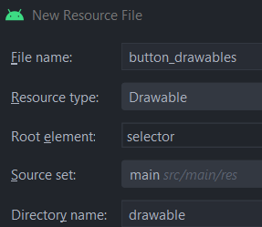
To create a Drawable state list, follow the steps above to create an XML resource, but select Drawable as the Resource type instead. The root element remains
<selector>. The directory name should be drawable.
-
Add another vector resource called ic_baseline_pause_24.xml for this step.
<vector android:height="24dp" android:tint="#000000" android:viewportHeight="24" android:viewportWidth="24" android:width="24dp" xmlns:android="http://schemas.android.com/apk/res/android"> <path android:fillColor="@android:color/white" android:pathData="M6,19h4L10,5L6,5v14zM14,5v14h4L18,5h-4z"/> </vector> -
Replace the content of button_drawables.xml with the code below. This will load the vector image created previously when the button is pressed.
<?xml version="1.0" encoding="utf-8"?> <selector xmlns:android="http://schemas.android.com/apk/res/android"> <item android:drawable="@drawable/ic_baseline_pause_24" android:state_pressed="true" /> <item android:drawable="@drawable/ic_baseline_play_arrow_24" /> </selector> -
Back in activity_main.xml, replace the value of
app:srcCompatto reference the new Drawable State List instead of the direct vector image.app:srcCompat="@drawable/button_drawables"
If we run the app now, we can see that both the color and Drawable are changed when the button is pressed.

Solution Code
activity_main.xml
<?xml version="1.0" encoding="utf-8"?>
<androidx.constraintlayout.widget.ConstraintLayout xmlns:android="http://schemas.android.com/apk/res/android"
   xmlns:app="http://schemas.android.com/apk/res-auto"
   xmlns:tools="http://schemas.android.com/tools"
   android:layout_width="match_parent"
   android:layout_height="match_parent"
   tools:context=".MainActivity">

   <ImageButton
       android:id="@+id/imageButton"
       android:layout_width="200dp"
       android:layout_height="200dp"
       android:backgroundTint="#00FFFFFF"
       android:scaleType="fitCenter"
       app:layout_constraintBottom_toBottomOf="parent"
       app:layout_constraintEnd_toEndOf="parent"
       app:layout_constraintStart_toStartOf="parent"
       app:layout_constraintTop_toTopOf="parent"
       app:srcCompat="@drawable/button_drawables"
       app:tint="@color/button_colors" />
</androidx.constraintlayout.widget.ConstraintLayout>
button_drawables.xml
<?xml version="1.0" encoding="utf-8"?>
<selector xmlns:android="http://schemas.android.com/apk/res/android">
   <item android:drawable="@drawable/ic_baseline_pause_24"
       android:state_pressed="true" />
   <item android:drawable="@drawable/ic_baseline_play_arrow_24" />
</selector>
button_colors.xml
<?xml version="1.0" encoding="utf-8"?>
<selector xmlns:android="http://schemas.android.com/apk/res/android">
   <item android:color="@color/purple_700"
       android:state_pressed="true"/>
   <item android:color="@color/purple_700"
       android:state_focused="true" />
   <item android:color="@color/black" />
</selector>
ic_baseline_pause_24.xml
<vector android:height="24dp" android:tint="#000000"
   android:viewportHeight="24" android:viewportWidth="24"
   android:width="24dp" xmlns:android="http://schemas.android.com/apk/res/android">
   <path android:fillColor="@android:color/white" android:pathData="M6,19h4L10,5L6,5v14zM14,5v14h4L18,5h-4z"/>
</vector>
ic_baseline_play_arrow_24
<vector android:height="24dp" android:tint="#000000"
   android:viewportHeight="24" android:viewportWidth="24"
   android:width="24dp" xmlns:android="http://schemas.android.com/apk/res/android">
   <path android:fillColor="@android:color/white" android:pathData="M8,5v14l11,-7z"/>
</vector>
Summary
We have learned how to change button color and drawables using state lists in this tutorial. The full project code can be found at https://github.com/dmitrilc/DaniwebModifyButtonColorUsingColorStateListResource.