Introduction
Today we are going to go over the very basics of web design and getting it right. I see a lot of web developers who say they are programmers but not designers (although sometimes I wonder even this.) However, this shouldn't mean you can't get the very basics of design right.
UX is a field of its own and it is carefully thought out, designs following a visual hierarchy, typography that is consisent. This all helps to keep users visiting your site and what's more coming back. So pay attention kids, class is in progress!
Typography
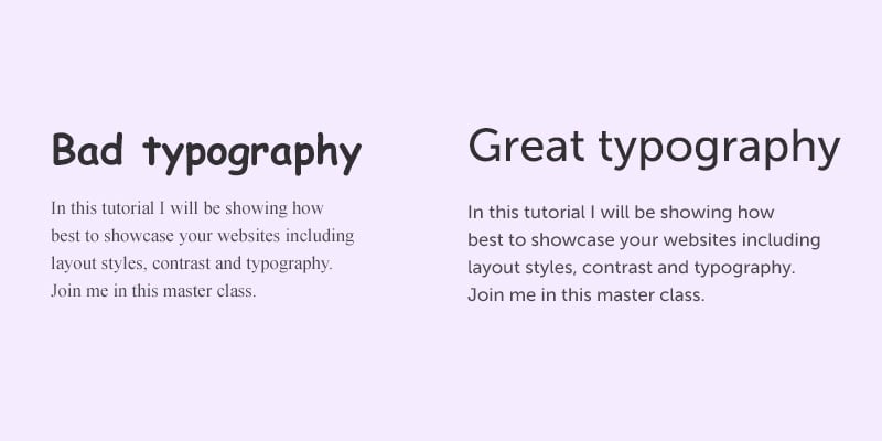
OK this is the very basics. You don't want to mix too many web fonts... I know it is a real shame because you have all those google web fonts available but seriously, stick to one web font or two, if you can. One font for <header> tags and another for the body.
See below:
Serif Vs non San serif 
Unless you know what you're doing, stick to web safe sans serif fonts. The most popular one today is probably helvetica or google's 'Open Sans.' Not only is it cleaner but it also serves a purpose -easy reading and that is what is it all about.
Keep your typography consistent
There is a reason why most css style sheets have h1,h2,h3,h4,h5 header tags. It is to provide consistency. All your heading fonts should be the same, for example h2 or h3 that you have defined in your style sheet. Remember visual hierarchy is also important. The natural flow of the page should be styled so the headings or call out boxes have naturally larger fonts than the body. It is so your eye gets drawn to that first.
Another point is maintain line height consistency, you don't want your typography too close or too far apart. See example below.
Carefully pick your font colors
The point to note here is your font should be readable. It should be contrasted against whatever background so your visitors can see what they are reading.
Padding spacing and vertical alignment
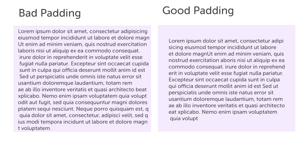
This one really gets my goat. Mainly because there are so many css frameworks out there to help you. What I'm talking about is poor consistency with vertical and horizontal alignment and padding. Set your style sheets so they are all the same. Or better still use a framework like bootstrap or skeleton. They make your lives and those viewing your site much much easier.

Don't forget, padding and alignment doesn't just apply to your divs, but also the content inside your divs. See final example: 
Conclusions
Web design doesn't just have to be for designers and photoshop users, web programmers will do well to follow these simple rules.
Below I've listed a few helpful tools to help you follow good web design.
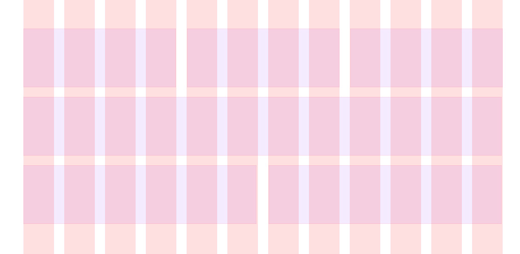
http://960.gs/ <-A grid system for photoshop
https://kuler.adobe.com/ <-Pick your color themes so they sing together
http://getbootstrap.com/ <- A css responsive framework that does all the hard work so you don't have to.
Thanks for reading.
