Study: People comfortable disclosing info on sketchy-looking sites

Emily Banks 0 Tallied Votes 424 Views Share

When participants of a recent study were asked to share sensitive information on two different online surveys -- one designed to look unprofessional and the other backed by a major university -- the participants were more likely to share private information on the unprofessional-looking site. Researchers from Carnegie Mellon released yesterday some of their , which will be published in the Journal of Consumer Research. The study found that "many consumers need help recognizing when their privacy is compromised," according to the release.

"How can we make sense of the contradictory attitudes that individuals display toward privacy—from the seemingly reckless willingness of some to post personal and even incriminating information on social network sites, to the concern people express over the range of information being collected about them and the way it's being used?" wrote authors Alessandro Acquisti, Leslie K. John, and George Loewenstein of Carnegie Mellon University.

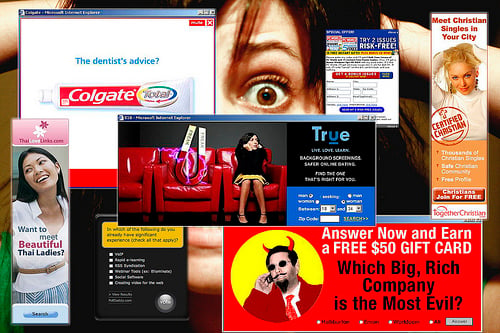
The study that compared surveys on a professional versus unprofessional site raises some serious concerns about consumer awareness. The headline for the unprofessional-looking site read "How BAD Are U???" with red lettering and even a cartoon devil. The counterpart to that survey stated that it was administered by the Carnegie Mellon University Executive Council Survey on Ethical Behaviors and, instead of a cartoon logo, it displayed the university crest.

The experiment asked the participants if they had partaken in different behaviors. As it turns out, people who took the "How BAD Are U???" survey were more honest and forthcoming in their responses.

"People seem naturally comfortable disclosing personal information on unprofessional websites—which are arguably more likely to misuse it," the authors wrote. "The present research raises issues about people's ability to navigate these complexities in a self-interested fashion."

The Carnegie Mellon study is titled "Strangers on a Plane: Context-dependent Willingness to Divulge Sensitive Information," and it will be printed in the February 2011 edition of the Journal of Consumer Research.

Photo by Pascale PirateChickan on Flickr. Used under Creative Commons License.
Dani AI

Generated

This thread highlights a persistent mismatch between how people judge safety and what actually protects their data. brought the topic here, and replies from , and illustrate the range of motivations — from seeking attention to valuing privacy — that interact with visual cues and tone.

A few quick psychology points explain why appearance matters. Casual or humorous design can signal a low‑stakes, anonymous audience and lower self‑presentation concerns; polished institutional cues suggest formality and accountability. People often use these fast heuristics (aesthetics, wording, implied audience) instead of checking the site’s data practices.

Practical checklist before sharing anything online:

  • Pause and ask why the site needs each piece of information and how it will be used.
  • Verify the address bar: correct domain name and HTTPS (lock icon), watch for typosquatting.
  • Look for a plain‑language privacy statement and contact details; search the site name plus “reviews” or “scam.”
  • Never enter SSNs, full payment credentials, or account passwords into casual surveys; use a throwaway email when appropriate.
  • Use a password manager and unique passwords; consider private browsing for one‑off forms.

If you collect data, be explicit: state purpose, retention, and security in plain language; minimize sensitive questions; show contact info and get clear consent; and use HTTPS plus encrypted storage. Designing a “casual” front end to encourage disclosure risks ethical harm and brand/legal fallout. As and note, motives vary, but visual polish is an unreliable proxy for true safety — treat it as a cue to verify, not as proof.

Member Avatar for Member #949455
Member #949455

The study that compared surveys on a professional versus unprofessional site raises some serious concerns about consumer awareness. The headline for the unprofessional-looking site read "How BAD Are U???" with red lettering and even a cartoon devil. The counterpart to that survey stated that it was administered by the Carnegie Mellon University Executive Council Survey on Ethical Behaviors and, instead of a cartoon logo, it displayed the university crest.

It depends how much publicity you want for yourself.

Everyone wants to be famous.

Kinda like those attention seekers.

Right now this day and age, it's not going to change any time soon.

I'm a very private person. So no one can put my picture on any website or online.

You will only see my Daniweb Gravator.

ellena980 -6 Junior Poster in Training

I am not agree with you all want to see professional good designed site.

Ancient Dragon 5,243 Achieved Level 70 Team Colleague Featured Poster

"People seem naturally comfortable disclosing personal information on unprofessional websites

Those are probably the same people who post prolifically on FaceBook and MyPage.

Be a part of the DaniWeb community

We're a friendly, industry-focused community of developers, IT pros, digital marketers, and technology enthusiasts meeting, networking, learning, and sharing knowledge.