If you mean you tab style buttons across the top of the page, well first off they are not even in a table they are in DIVs. Also, I cannot actually see 7 buttons in the html and it doesn't seem to appear anywhere on my screen.
BTW. Your page is way to wide which is a result of absolute positioning and looks terrible on anything smaller than 1280*1024. This may be the web standard by 2010 but it isn't now.
I really think you have made this design very hard for yourself by having an extensive use of z-index. I would really advice you to start again and also take a bt more of a minimalist approach to your design because it is very big and bold. Less is sometimes more.
If you are still interested just paste your html the text box ont he reply for between these two tags: [*html] and [/*html] (take away the stars. For example
There are dvd decrypters available but they are ILLEGAL so if this is for a serious website you should not do it. It could ruin the clients credibility and is probably not worth doing. After you have got the film of the dvd you can either play it as an mpeg on the web or you can convert it to quicktime. A good program for this can be found here http://www.xilisoft.com/ipod-video-converter-mac.html It is not free though.
I advise against doing this because it is ILLEGAL. You should just explain this to your client and they should understand.
I need to know how you have layed out your page, ie. is it just one big background image or what?. If it is one big image then in the properties you should see the size of the image. This should be set to 780px * 500px.
Just a pointer, 780px is to wide to display on a 800*600 screen. Just to make sure you should set it down to somewhere in the 770s.
I would use Dreamweaver if you want to use a wysiwyg or crimson editor if you want to do the code side of things. You should also invest in a graphics package such as Paint Shop Pro or Photoshop.
i used webpage maker an excellent programme to create your 1st website. Dreamweaver ? i want to use it but im scared lol. i have been told it is difficult to use . anyone here tell me otherwise?
Dreamweaver is definately not hard to use. You should download an eval version and try it.
I would have t say the obvious answer. It depends what the client wants. I generally like colours to be quite bright but not obstructive. The page width is really based on how you want to place the content and how much needs to be there when the user looks at the page without scrolling. I do not use any formatting ie. fonts, width, colors in the html, atleast not any more. Column designs are cool as long as you have different content to go in each column. What I am trying to say is that everything or anything can look good if it is done well
You should just get something like Photoshop or a slightly more budget friendly option like Paint Shop Pro or even GIMP. These will all get the right result for your website and is far simpler than getting into code.
Create Main table with (example) two rows and three columns. Then merge columns in second row and insert new table in that row. That should do it.
Btw. I recomend using div tags for layout and tables just for tabular data.
That's how it is done but do try CSS. The only way to set out a page well with tables is by using nested tables so you should really have a go with that.
Are you sure frames is the right way to go about this. Maybe for a hobby website but I would not recommend it for anything serious. It looks very bad but you can achieve basically the same results using include files. However, unfortunately this is scripting.
I haven't tried it but the idea sounds awesome and would be very very useful. Especially being able to see what your site looks like in previous versions of browsers.
Ok. If you say you can type onto the image but your text comes out small at 72pt this is probably because you have the resolution of the image set to high. Unless you are using the image to be printed the resolution should be about 72dpi. You should also save you image as a PSD file before editing it and then save for web. Create a new layer for text and make sure you don't have a strange font selected.
I doubt Microsoft really care that those websites are there because microsoft rely on people who are low end computer users for the web browser which means they will mainly just google IE7 and that website doesn't come up.
I wonder whether the guy who owns ie7.com is getting any money from firefox.
If those pieces of anti-virus can't find it then it is more likely not to be a virus. These kind of warnings sometimes pop-up if you are connected to a p2p network or downloading via bit torrent. These programs can also slow down you PC. I can also see that you have some AOL software and I would advise that you steer clear of AOL! I am sure you will hav tried restarting your computer. Failing this try a system restore (start>accessories>system tools>System Resore). You will not loose any files.
This may just simply be because your mouse speed has been changed. The best thing to do is to run a virus scan and a spyware scan, whilst doing this you should not be connected to the internet. You should then restart your computer and if it still does not work try another mouse (preferably not USB) and see whether this works.
It is not completely clear to me what you mean but I guess you mean this:
You have two hotmail/msn accounts belonging to yourself. When you are online with one of these accounts on MSN it shows that the other is online, but it is not.
I have to say this is not really an emergency because it is not really casuing you any problems. This problem is likely to have occured because of a problem when you logged off of you other MSN address. Or someone has hacked their way into your account. But the second option is extremely unlikely.
If you have any more questions do not hesitate to ask.
This tutorial will enable you to create a tabbed navigation bar to use on your website.
1) Open PhotoShop and create a new document with the size 670*70px.
2) Grab the rounded rectangle tool and draw a rectangle on the canvas, you will need to set the radius to 5px.
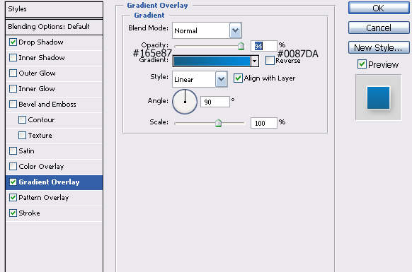
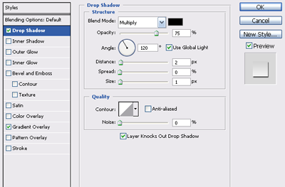
3) Next you need to add some color to this rectangle, so open the blending options for this layer by double clicking on the layer in the layer pallet.
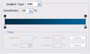
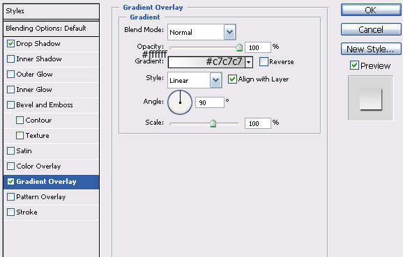
4) You will need to add a gradient overlay by clicking on the check box and going into the gradient overlay settings. Double click the picture of the gradient and set the color on the left to #032c45 and the color on the right to #036399.
5) Click OK and return to the main gradient settings. The blend mode should be set to normal, and check the box called reverse. The gradient should be at 100% opacity and set to linear at 90° with the gradient set to align with layer. Click OK to the blending option box and your canvas should now look like this:
6) Now you need to create something for the tabs to be hanging from. So first create a new layer using layer>new>layer and call this layer pole. Select the rectangle tool and draw a rectangle that is …
I think this is a really good idea but the only thing is for the people who are using it as the avatar it is not showing the most recent version. Could anyone explain why that is?
Yup I would definalty use CSS. If you get the time, check out the brilliant tutorials over at Adobe for CSS. I believe Adrian Senior had a good one that I learnt loads from. Once you get the basics of CSS you can change everything on a website. :)
This piece of CSS will make your hyperlink have no underline when the user hovers over it. It will also make the text color change to black when it has been visited and red when it is clicked on.
http://www.daniweb.com/techtalkforums/post265577.htm - this guy here tries to do the same thing - I hope he tries my way and we can see the result :) . Otherwise I will have to do try it, but I don't have a lot of time. :)
I made this post and have tried your solution. Unfortunately although you set the height 100% it does not stretch the image to fit the browser windows height in IE and in Firefox it ust sets the image to 100% if it's normal size. And as Vishesh said this will not stop the background from staying static. This is not really a solution in my eyes. In the end I just made sure that my image displays the needed info on a 800*600 screen and a 1280*1024 screen. Oh well you better keep trying. BTW z-index is not a good idea for this because the only way you can set the contents position is by pixel or percentage which means you cannot center it.
No, I'm not new and I can do everything with css I have ever wanted to. My new site photoshopthis should prove this. It will be up online on the 1st novemeber.